Search This Blog

Monday, March 6, 2023

Sentence spacing

From Wikipedia, the free encyclopedia

Sentence spacing concerns how spaces are inserted between sentences in typeset text and is a matter of typographical convention. Since the introduction of movable-type printing in Europe, various sentence spacing conventions have been used in languages with a Latin alphabet. These include a normal word space (as between the words in a sentence), a single enlarged space, and two full spaces.

Until the 20th century, publishing houses and printers in many countries used additional space between sentences. There were exceptions to this traditional spacing method—some printers used spacing between sentences that was no wider than word spacing. This was French spacing—a term synonymous with single-space sentence spacing until the late 20th century. With the introduction of the typewriter in the late 19th century, typists used two spaces between sentences to mimic the style used by traditional typesetters. While wide sentence spacing was phased out in the printing industry in the mid-20th century, the practice continued on typewriters and later on computers. Perhaps because of this, many modern sources now incorrectly claim that wide spacing was created for the typewriter.

The desired or correct sentence spacing is often debated, but some sources now claim that an additional space is not necessary. From around 1950, single sentence spacing became standard in books, magazines, and newspapers, and the majority of style guides that use a Latin-derived alphabet as a language base now prescribe or recommend the use of a single space after the concluding punctuation of a sentence. However, some sources still state that additional spacing is correct or acceptable. Some people preferred double sentence spacing because that was how they were taught to type. The few direct studies conducted since 2002 have produced inconclusive results as to which convention is more readable.

History

Traditional typesetting

↑ (1874) typeset text

↓ (1909) sentences with at least an em-space between them

Shortly after the invention of movable type, highly variable spacing was created, which could create spaces of any size and allowed for perfectly even justification. Early American, English, and other European typesetters' style guides (also known as printers' rules) specified spacing standards that were all essentially identical from the 18th century onwards. These guides—e.g., Jacobi in the UK (1890) and MacKellar, Harpel, and De Vinne (1866–1901) in the U.S.—indicated that sentences should be em-spaced, and that words should be 1/3 or 1/2 em-spaced. The relative size of the sentence spacing would vary depending on the size of the word spaces and the justification needs. For most countries, this remained the standard for published work until the 20th century. Yet, even in this period, there were publishing houses that used a standard word space between sentences.

Mechanical type and the advent of the typewriter

Mechanical type systems introduced near the end of the 19th century, such as the Linotype and Monotype machines, allowed for some variable sentence spacing similar to hand composition. Just as these machines revolutionized the mass production of text, the advent of the typewriter around the same time revolutionized the creation of personal and business documents. But the typewriters' mechanical limitations did not allow variable spacing—typists could only choose the number of times they pressed the space bar. Typists in some English-speaking countries initially learned to insert three spaces between sentences to approximate the wider sentence spacing used in traditional printing, but later settled on two spaces, a practice that continued throughout the 20th century. This became known as English spacing and marked a divergence from French typists, who continued to use French spacing.

Transition to single spacing

In the early 20th century, some printers began using one and a half interword spaces (an "en quad") to separate sentences. This standard continued in use, to some extent, into the 1990s.

Magazines, newspapers, and books began to adopt the single-space convention in the United States in the 1940s and in the United Kingdom in the 1950s. Typists did not move to single spacing simultaneously.

Technological advances began affecting sentence spacing methods. In 1941, IBM introduced the Executive, a typewriter capable of proportional spacing, which had been used in professional typesetting for hundreds of years. This innovation broke the hold that the monospaced font had on the typewriter, reducing the severity of its mechanical limitations. However, this innovation did not spread throughout the typewriter industry; the majority of mechanical typewriters, including all of the widely distributed models, remained monospaced, while a small minority of special models carried the innovations. By the 1960s, electronic phototypesetting systems ignored runs of white space in text. This was also true for the World Wide Web, as HTML normally ignores additional spacing, although in 2011 the CSS 2.1 standard officially added an option that can preserve additional spaces. In the 1980s, desktop publishing software provided the average writer with more advanced formatting tools.

Modern literature

Typography

Early positions on typography (the "arrangement and appearance of text") supported traditional spacing techniques in English publications. In 1954, Geoffrey Dowding's book Finer Points in the Spacing and Arrangement of Type underscored the widespread shift from a single enlarged em space to a standard word space between sentences.

With the advent of the computer age, typographers began deprecating double spacing, even in monospaced text. In 1989, Desktop Publishing by Design stated that "typesetting requires only one space after periods, question marks, exclamation points, and colons" and identified single sentence spacing as a typographic convention. Stop Stealing Sheep & Find Out How Type Works (1993) and Designing with Type: The Essential Guide to Typography (2006) both indicate that uniform spacing should be used between words, including between sentences.

More recent works on typography weigh in strongly. Ilene Strizver, founder of the Type Studio, says: "Forget about tolerating differences of opinion: typographically speaking, typing two spaces before the start of a new sentence is absolutely, unequivocally wrong." The Complete Manual on Typography (2003) states that "The typewriter tradition of separating sentences with two-word spaces after a period has no place in typesetting" and that the single space is "standard typographic practice". The Elements of Typographic Style (2004) advocates a single space between sentences, noting that "your typing as well as your typesetting will benefit from unlearning this quaint [double spacing] Victorian habit".

David Jury's book About Face: Reviving the Rules of Typography (2004)—published in Switzerland—clarifies the contemporary typographic position on sentence spacing:

Word spaces, preceding or following punctuation, should be optically adjusted to appear to be of the same value as a standard word space. If a standard word space is inserted after a full point or a comma, then, optically, this produces a space of up to 50% wider than that of other word spaces within a line of type. This is because these punctuation marks carry space above them, which, when added to the adjacent standard word spaces, combines to create a visually larger space. Some argue that the "additional" space after a comma and full point serves as a "pause signal" for the reader. But this is unnecessary (and visually disruptive) since the pause signal is provided by the punctuation mark itself.

Style and language guides

Traditional spacing examples from the 1911 Chicago Manual of Style

Style guides

Early style guides for typesetting used a wider space between sentences than between words—"traditional spacing", as shown in the illustration to the right. During the 20th century, style guides commonly mandated two spaces between sentences for typewritten manuscripts, which were used prior to professionally typesetting the work. As computer desktop publishing became commonplace, typewritten manuscripts became less relevant and most style guides stopped making distinctions between manuscripts and final typeset products. In the same period, style guides began changing their guidance on sentence spacing. The 1969 edition of the Chicago Manual of Style used em spaces between sentences in its text; by the 2003 edition it had changed to single sentence spacing for both manuscript and print. By the 1980s, the United Kingdom's Hart's Rules (1983) had shifted to single sentence spacing. Other style guides followed suit in the 1990s. Soon after the beginning of the 21st century, the majority of style guides had changed to indicate that only one word space was proper between sentences.

Modern style guides provide standards and guidance for the written language. These works are important to writers, since "virtually all professional editors work closely with one of them in editing a manuscript for publication". Late editions of comprehensive style guides, such as the Oxford Style Manual (2003) in the United Kingdom and the Chicago Manual of Style (2010) in the United States, provide standards for a wide variety of writing and design topics, including sentence spacing. The majority of style guides now prescribe the use of a single space after terminal punctuation in final written works and publications. A few style guides allow double sentence spacing for draft work, and the Gregg Reference Manual makes room for double and single sentence spacing based on author preferences. Web design guides do not usually provide guidance on this topic, as "HTML refuses to recognize double spaces altogether". These works themselves follow the current publication standard of single sentence spacing.

The European Union's Interinstitutional Style Guide (2008) indicates that single sentence spacing is to be used in all European Union publications—encompassing 23 languages. For the English language, the European Commission's English Style Guide (2010) states that sentences are always single-spaced. The Style Manual: For Authors, Editors and Printers (2007), first published in 1966 by the Commonwealth Government Printing Office of Australia, stipulates that only one space is used after "sentence-closing punctuation" and that "Programs for word processing and desktop publishing offer more sophisticated, variable spacing, so this practice of double spacing is now avoided because it can create distracting gaps on a page."

National languages not covered by an authoritative language academy typically have multiple style guides, only some of which may discuss sentence spacing. This is the case in the United Kingdom. The Oxford Style Manual (2003) and the Modern Humanities Research Association's MHRA Style Guide (2002) state that only single spacing should be used. In Canada, both the English- and French-language sections of the Canadian Style, A Guide to Writing and Editing (1997), prescribe single sentence spacing. In the United States, many style guides—such as the Chicago Manual of Style (2003)—allow only single sentence spacing. The most important style guide in Italy, Il Nuovo Manuale di Stile (2009), does not address sentence spacing, but the Guida di Stile Italiano (2010), the official guide for Microsoft translation, tells users to use single sentence spacing "instead of the double spacing used in the United States".

Language guides

Some languages, such as French and Spanish, have academies that set language rules. Their publications typically address orthography and grammar as opposed to matters of typography. Style guides are less relevant for such languages, as their academies set prescriptive rules. For example, the Académie française publishes the Dictionnaire de l'Académie française for French speakers worldwide. The 1992 edition does not provide guidance on sentence spacing, but is single-sentence-spaced throughout—consistent with historical French spacing. The Spanish language is similar. The most important body within the Association of Spanish Language Academies, the Royal Spanish Academy, publishes the Diccionario de la lengua española, which is viewed as prescriptive for the Spanish language worldwide. The 2001 edition does not provide sentence-spacing guidance, but is itself single-sentence-spaced. The German language manual Empfehlungen des Rats für deutsche Rechtschreibung ("Recommendations of the Council for German Orthography"; 2006) does not address sentence spacing. The manual itself uses one space after terminal punctuation. Additionally, the Duden, the German-language dictionary most commonly used in Germany, indicates that double sentence spacing is an error.

Grammar guides

A few reference grammars address sentence spacing, as increased spacing between words is punctuation in itself. Most do not. Grammar guides typically cover terminal punctuation and the proper construction of sentences—but not the spacing between sentences. Moreover, many modern grammar guides are designed for quick reference and refer users to comprehensive style guides for additional matters of writing style. For example, the Pocket Idiot's Guide to Grammar and Punctuation (2005) points users to style guides such as the MLA Style Manual for consistency in formatting work and for all other "editorial concerns". The Grammar Bible (2004) states that "The modern system of English punctuation is by no means simple. A book that covers all the bases would need to be of considerable breadth and weight and anyone interested in such a resource is advised to consult the Chicago Manual of Style."

Computer era

In the computer era, spacing between sentences is handled in several different ways by various software packages. Some systems accept whatever the user types, while others attempt to alter the spacing or use the user input as a method of detecting sentences. Computer-based word processors and typesetting software such as troff and TeX allow users to arrange text in a manner previously only available to professional typesetters.

The text-editing environment in Emacs uses a double space following a period to identify the end of sentences unambiguously; the double-space convention prevents confusion with periods within sentences that signify abbreviations. How Emacs recognizes the end of a sentence is controlled by the settings sentence-end-double-space and sentence-end.

The Unix typesetter program Troff uses two spaces to mark the end of a sentence. This allows the typesetter to distinguish sentence endings from abbreviations and to typeset them differently. Early versions of Troff, which only typeset in fixed-width fonts, would automatically add a second space between sentences, which were detected based on the combination of terminal punctuation and a line feed.

In the April 2020 update, Microsoft Word started highlighting two spaces after a period as an error and offers a correction of one space.

Multiple spaces are eliminated by default in most World Wide Web content, whether or not they are associated with sentences. There are options for preserving spacing, such as the CSS white-space property, and the <pre> tag.

Controversy

James Felici, author of the Complete Manual of Typography, says that the topic of sentence spacing is "the debate that refuses to die ... In all my years of writing about type, it's still the question I hear most often, and a search of the web will find threads galore on the subject."

Many people are opposed to single sentence spacing for various reasons. Some state that the habit of double spacing is too deeply ingrained to change. Others claim that additional space between sentences improves the aesthetics or readability of text. Proponents of double sentence spacing also state that some publishers may still require double-spaced manuscript submissions from authors. A key example noted is the screenwriting industry's monospaced standard for screenplay manuscripts, Courier, 12-point font, although some works on screenwriting indicate that Courier is merely preferred—proportional fonts may be used. Some reliable sources state simply that writers should follow their particular style guide, but proponents of double spacing caution that publishers' guidance takes precedence, including those that ask for double-sentence-spaced manuscripts.

One of the most popular arguments against wider sentence spacing is that it was created for monospaced fonts of the typewriter and is no longer needed with modern proportional fonts. However, proportional fonts existed together with wide sentence spacing for centuries before the typewriter and remained for decades after its invention. When the typewriter was first introduced, typists were most commonly taught to use three spaces between sentences. This gradually shifted to two spaces, while the print industry remained unchanged in its wide em-spaced sentences. Some sources now state it is acceptable for monospaced fonts to be single-spaced today, although other references continue to specify double spacing for monospaced fonts. The double-space typewriter convention has been taught in schools in typing classes and remains the practice in many cases. Some voice concern that students will later be forced to relearn how to type.

Most style guides indicate that single sentence spacing is proper for final or published work today, and most publishers require manuscripts to be submitted as they will appear in publication—with single sentence spacing. Writing sources typically recommend that prospective authors remove extra spaces before submitting manuscripts, although other sources state that publishers will use software to remove the spaces before final publication.

Effects on readability and legibility

Claims abound regarding the legibility and readability of the single and double sentence spacing methods—by proponents on both sides. Supporters of single spacing assert that familiarity with the current standard in books, magazines, and the Web enhances readability, that double spacing looks strange in text using proportional fonts, and that the "rivers" and "holes" caused by double spacing impair readability. Proponents of double sentence spacing state that the extra space between sentences enhances readability by providing clearer breaks between sentences and making text appear more legible.

However, typographic opinions are typically anecdotal with no basis in evidence. "Opinions are not always safe guides to legibility of print", and when direct studies are conducted, anecdotal opinions—even those of experts—can turn out to be false. Text that seems legible (visually pleasing at first glance) may be shown to actually impair reading effectiveness when subjected to scientific study.

Studies

Direct studies on sentence spacing include those by Loh, Branch, Shewanown, and Ali (2002); and Clinton, Branch, Holschuh, and Shewanown (2003); with results favoring neither single, double, nor triple spacing. The 2002 study tested participants' reading speed for passages of on-screen text with single and double sentence spacing. The authors stated that "the 'double space group' consistently took longer time to finish than the 'single space' group" but concluded that "there was not enough evidence to suggest that a significant difference exists". The 2003 study analyzed on-screen single, double, and triple spacing. In both cases, the authors stated that there was insufficient evidence to draw a conclusion. Ni, Branch, Chen, and Clinton conducted a similar study in 2009 using identical spacing variables. The authors concluded that the "results provided insufficient evidence that time and comprehension differ significantly among different conditions of spacing between sentences". A 2018 study of 60 students found that those who used two word spaces between sentences read the same text 3 percent faster than with a monospaced font (Courier New).
Exclamation mark

From Wikipedia, the free encyclopedia

!
Exclamation mark
Other namesExclamation point
U+0021 ! EXCLAMATION MARK (&excl;)
¡ ՜ ǃ
Inverted exclamation mark Armenian exclamation mark Alveolar
click
Small
exclamation sign
See also
U+00A1 ¡ INVERTED EXCLAMATION MARK

The exclamation mark, !, or exclamation point (American English), is a punctuation mark usually used after an interjection or exclamation to indicate strong feelings or to show emphasis. The exclamation mark often marks the end of a sentence, for example: "Watch out!". Similarly, a bare exclamation mark (with nothing before or after) is often used in warning signs. The exclamation mark is often used in writing to make a character seem as though they are shouting and/or excited/surprised.

Other uses include:

  • In mathematics, it denotes the factorial operation.
  • Several computer languages use ! at the beginning of an expression to denote logical negation. For example,!A means "the logical negation of A", also called "not A". This usage has spread to ordinary language (e.g., "!clue" means no-clue or clueless).
  • Some languages use ! to denote a click consonant.

History

Graphically, the exclamation mark is represented by variations on the theme of a full stop point with a vertical line above. One theory of its origin posits derivation from a Latin exclamation of joy, namely io, analogous to "hurray"; copyists wrote the Latin word io at the end of a sentence, to indicate expression of joy. Over time, the i moved above the o; that o first became smaller, and (with time) a dot.

In the 15th century, the exclamation mark was introduced into English printing to show emphasis. It was later called by many names, including point of admiration (1611), note of exclamation or admiration (1657), sign of admiration or exclamation, exclamation point (1824), and finally, exclamation mark (1839).

Many older or portable typewriters did not have the exclamation mark. Instead the user typed a full stop and then backspaced and overtyped an apostrophe.

Slang and other names for the exclamation mark

Now obsolete, the name ecphoneme was documented in the early 20th century.

In the 1950s, secretarial dictation and typesetting manuals in America referred to the mark as "bang", perhaps from comic books – where the ! appeared in dialogue balloons to represent a gun being fired – although the nickname probably emerged from letterpress printing. This "bang" usage is behind the names of the interrobang, an unconventional typographic character, and a shebang, a feature of Unix computer systems.

In the printing world, the exclamation mark can be called a screamer, a gasper, a slammer, a dog's cock, or a startler.

In hacker culture, the exclamation mark is called "bang", "shriek", or, in the British slang known as Commonwealth Hackish, "pling". For example, the password communicated in the spoken phrase "Your password is em-zero-pee-aitch-bang-en-three" ("em-nought-pee-aitch-pling-en-three" in Commonwealth Hackish) is m0ph!n3.

Languages

The exclamation mark is common to languages using the Latin alphabet, although usage varies slightly between languages. It has also been adopted in languages written in other scripts, such as languages written with Cyrillic or Arabic scripts, Chinese characters, and Devanagari.

English

A sentence ending in an exclamation mark may represent an exclamation or an interjection (such as "Wow!", "Boo!"), or an imperative ("Stop!"), or may indicate astonishment or surprise: "They were the footprints of a gigantic hound!" Exclamation marks are occasionally placed mid-sentence with a function similar to a comma, for dramatic effect, although this usage is obsolete: "On the walk, oh! there was a frightful noise."

Informally, exclamation marks may be repeated for additional emphasis ("That's great!!!"), but this practice is generally considered unacceptable in formal prose.

The exclamation mark is sometimes used in conjunction with the question mark. This can be in protest or astonishment ("Out of all places, the squatter-camp?!"); a few writers replace this with a single, nonstandard punctuation mark, the interrobang, which is the combination of a question mark and an exclamation mark.

Overly frequent use of the exclamation mark is generally considered poor writing, as it distracts the reader and decreases the mark's significance.

Cut out all these exclamation points... An exclamation point is like laughing at your own joke.

Some authors, most notably Tom Wolfe, are known for unashamedly liberal use of the exclamation mark. In comic books, the very frequent use of exclamation mark is common—see Comics, below.

For information on the use of spaces after an exclamation mark, see the discussion of spacing after a full stop.

Several studies have shown that women use exclamation marks more than men do. One study suggests that, in addition to other uses, exclamation marks may also function as markers of friendly interaction, for example, by making "Hi!" or "Good luck!" seem friendlier than simply "Hi." or "Good luck." (with periods). However, use of exclamation marks in contexts that are not unambiguously positive can be misinterpreted as indicating hostility.

In English writing and often subtitles, a (!) symbol (an exclamation mark within parentheses) implies that a character has made an obviously sarcastic comment e.g.: "Ooh, a sarcasm detector. That's a really useful invention(!)" It also is used to indicate surprise at one's own experience or statement.

French

In French, as well as marking exclamations or indicating astonishment, the exclamation mark is also commonly used to mark orders or requests: Viens ici ! (English: 'Come here!'). When available, a 'narrow no-break space' (espace fine insécable) is used between the last word and the exclamation mark in European French. If not, a regular non-breaking space (espace insécable) is currently used. In Canadian French, either no space is used or a small space (espace fine insécable) is inserted if available. One can also combine an exclamation mark with a question mark at the end of a sentence where appropriate.

Fula in Adlam

In Fula written in the Adlam script, exclamative sentences start with U+1E95E 𞥞 ADLAM INITIAL EXCLAMATION MARK and end with the ASCII exclamation mark. For example, 𞥞 𞤢𞤤𞤢𞥄 !, "No!".

German

German uses the exclamation mark for several things that English conveys with other punctuation:

  • It is used at the end of imperative sentences even when not particularly emphatic: Ruf mich morgen an! ('Call me tomorrow.') A normal full stop, as in English, is fairly common but is considered substandard.
  • A related use is on signs that express a command or interdiction: Betreten verboten! (English: 'No trespassing!').
  • The exclamation mark may also be used in the salutation line of a letter: Lieber Hans! (English: 'Dear Hans,'). However, the use of a comma is equally correct and is more common.

Cantonese

Cantonese has not historically used dedicated punctuation marks, rather relying on grammatical markers to denote the end of a statement. Usage of exclamation marks is common in written Mandarin and in some Yue speaking regions. The Canton and Hong Kong regions, however, generally refused to accept the exclamation mark as it was seen as carrying with it unnecessary and confusing Western connotations; however, an exclamation mark, including in some written representations of colloquy in Cantonese, can be used informally to indicate strong feeling.

Mandarin Chinese

It is called 感叹号 in China and 感嘆號 in Taiwan, both pronounced Gǎn tàn hào.

Greek

In Modern Greek, the exclamation mark (Θαυμαστικό, thavmastikó) has been introduced from Latin scripts and is used identically, although without the reluctance seen in English usage. A minor grammatical difference is that, while a series of interjections each employ an exclamation mark (e.g., Ωχ! Αχ!, Ōch! Ach!, 'Oops! Oh!'), an interjection should only be separated from an extended exclamation by a comma (e.g., Ωχ, ξέχασα το μάτι της κουζίνας ανοιχτό!, Ōch, xéchasa to máti tīs kouzínas anoichtó!, 'Oops! I left the stove on.').

Hungarian

In Hungarian, an exclamation mark is put at the end of exclamatory, imperative or prohibitive sentences, and sentences expressing a wish (e.g. De szép! – 'How beautiful!', A fűre lépni tilos! – 'Keep off the grass', Bárcsak sikerülne a tervem! – 'If only my plan would work out.'). The use of the exclamation mark is also needed when addressing someone and the addressing is a separate sentence. (typically at the beginning of letters, e.g. Kedves Péter! – 'Dear Peter,'). Greetings are also typically terminated with an exclamation mark (e.g. Jó estét! – 'Good evening.').

Solomon Islands Pidgin

In Solomon Islands Pidgin, the phrase may be between admiration marks. Compare Nomoa. ("No.") and !Nomoa nao! ("Certainly not!").

Spanish

Trilingual billboard in Barcelona (detail), showing the initial exclamation mark for Spanish, but not for Catalan (top line) and English

In Spanish, a sentence or clause ending in an exclamation mark must also begin with an inverted exclamation mark (the same also applies to the question mark): ¿Estás loco? ¡Casi la matas!, 'Are you crazy? You almost killed her!'

As in British English, a bracketed exclamation mark may be used to indicate irony or surprise at a statement: Dice que esta noche no va a salir de fiesta (!), 'He said that he's not going to a party tonight(!).' Such use is not matched by an inverted opening exclamation mark.

Turkish

In Turkish, an exclamation mark is used after a sentence or phrase for emphasis, and is common following both commands and the addressees of such commands. For example, in the Ordular! İlk hedefiniz Akdenizdir, ileri! ('Armies! Your first target is the Mediterranean') order by Atatürk, ordular ('the armies') constitute the addressee. It is further used in parentheses, (!), after a sentence or phrase to indicate irony or sarcasm: Çok iyi bir iş yaptın (!), 'You've done a very good job – Not!'.

Limbu

In Limbu, an exclamation mark is used after a Limbu sentence or phrase for emphasis, and is common following both commands and the addressees of such commands. For example, in the Limbu sentence ᤐᤚᤢ᥄ ᤄᤨᤘᤑ ᤂᤥᤆᤌᤙ Mediterranean, ᤚᤦᤛᤅ᥄Paṡu! Ghōwapha khōcathaśa Mediterranean, ṡausaṅa! (Armies! Your first target is the Mediterranean!). It is further used in parentheses, (᥄), after a sentence or phrase to indicate irony or sarcasm: ᤖᤥᤂᤌ ᤔᤚᤗ ᤐᤤ ᤊᤇ ᤃᤦᤄ (᥄)Rōkhatha maṡala pai yancha gaugha (!) (You did a very good job — Not!).

Phonetics

In Khoisan languages, and the International Phonetic Alphabet, the exclamation mark is used as a letter to indicate the postalveolar click sound (represented as q in Zulu orthography). In Unicode, this letter is properly coded as U+01C3 ǃ LATIN LETTER RETROFLEX CLICK and distinguished from the common punctuation symbol U+0021 ! EXCLAMATION MARK to allow software to deal properly with word breaks.

The exclamation mark has sometimes been used as a phonetic symbol to indicate that a consonant is ejective. More commonly this is represented by an apostrophe, or a superscript glottal stop symbol (U+02C0 ˀ MODIFIER LETTER GLOTTAL STOP).

Proper names

Although not part of dictionary words, exclamation marks appear in some brand names and trade names, including Yum! Brands (parent of fast food chains like Taco Bell and KFC), Web services Yahoo! and Joomla!, and the online game Kahoot!. It appears in the titles of stage and screen works, especially comedies and musicals; examples include the game show Jeopardy!; the '60s musical TV show Shindig!; musicals Oklahoma!, Mamma Mia!, Oliver! and Oh! Calcutta!; and movies Airplane! and Moulin Rouge!. Writer Elliot S! Maggin and cartoonist Scott Shaw! include exclamation marks in their names. In the 2016 United States presidential campaign, Republican candidate Jeb Bush used "Jeb!" as his campaign logo.

Place names

Road sign marking the entrance to Westward Ho!

The English town of Westward Ho!, named after the novel by Charles Kingsley, is the only place name in the United Kingdom that officially contains an exclamation mark. There is a town in Quebec called Saint-Louis-du-Ha! Ha!, which is spelled with two exclamation marks. The city of Hamilton, Ohio, changed its name to Hamilton! in 1986, but neither the United States Board on Geographic Names nor mapmakers Rand McNally recognised the change. The city of Ostrava, Czech Republic, changed its logotype to Ostrava!!! in 2008.

Warnings

Warning signs are often an exclamation mark enclosed within a triangle.
 
New Zealand road sign warning of a "cattle stop" (cattle grid/cattle guard)

Exclamation marks are used to emphasize a precautionary statement.

On warning signs, an exclamation mark is often used to draw attention to a warning of danger, hazards, and the unexpected. These signs are common in hazardous environments or on potentially dangerous equipment. A common type of this warning is a yellow triangle with a black exclamation mark, but a white triangle with a red border is common on European road warning signs.

Use in various fields

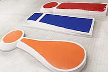
Custom cut tri-color PVC stands representing different styles of an exclamation mark
 
Aalto University School of Business Logo 2020 (exclamation mark)

Mathematics and formal logic

In elementary mathematics, the symbol represents the factorial operation. The expression n! means "the product of the integers from 1 to n". For example, 4! (read four factorial) is 4 × 3 × 2 × 1 = 24. (0! is defined as 1, which is a neutral element in multiplication, not multiplied by anything.) Additionally, it can also represent the uniqueness quantifier or, if used in front of a number, it can represent a subfactorial.

In linear logic, the exclamation mark denotes one of the modalities that control weakening and contraction.

Computing

In computing, the exclamation mark is ASCII character 33 (21 in hexadecimal). Due to its availability on even early computers, the character was used for many purposes. The name given to "!" by programmers varies according to their background, though it was very common to give it a short name to make reading code aloud easier. "Bang" is very popular. In the UK the term pling was popular in the earlier days of computing, whilst in the United States, the term shriek was used. It is claimed that these word usages were invented in the US and shriek is from Stanford or MIT; however, shriek for the ! sign is found in the Oxford English Dictionary dating from the 1860s.

Many computer languages using C-style syntax use "!" for logical negation; !A means "not A", and A != B means "A is not equal to B". This negation principle has spread to ordinary language; for example, the word "!clue" is used as a synonym for "no-clue" or "clueless". The symbol in formal logic for negation is ¬ but, as this symbol is not present as standard on some keyboards, the C convention has spread informally to other contexts.

Early e-mail systems also used the exclamation mark as a separator character between hostnames for routing information, usually referred to as "bang path" notation.

In the IRC protocol, a user's nickname and ident are separated by an exclamation mark in the hostmask assigned to him or her by the server.

In UNIX scripting (typically for UNIX shell or Perl), "!" is usually used after a "#" in the first line of a script, the interpreter directive, to tell the OS what program to use to run the script. #! is usually called a "hash-bang" or shebang. A similar convention for PostScript files calls for the first line to begin with %!, called "percent-bang".

An exclamation mark starts history expansions in many Unix shells such as bash and tcsh where !! executes the previous command and !* refers to all of the arguments from the previous command.

Acorn RISC OS uses filenames starting with pling to create an application directory: for instance a file called !Run is executed when the folder containing it is double-clicked (holding down shift prevents this). There is also !Boot (executed the first time the application containing it comes into view of the filer), !Sprites (icons), !Help, and others.

In APL, !x is used for factorial of x (backwards from math notation), and also for the binomial coefficient: k!n means or n!k!(nk)!.

BBC BASIC used pling as an indirection operator, equivalent to PEEK and POKE of four bytes at once.

BCPL, the precursor of C, used "!" for pointer and array indirection: !P is equivalent to *P in C, and P!3 is equivalent to P[3] in C.

In the Haskell programming language, "!" is used to express strictness.

In the Kotlin programming language, "!!" ("double-bang") is the not-null assertion operator, used to override null safety so as to allow a null pointer exception.

In the ML programming language (including Standard ML and OCaml), "!" is the operator to get the value out of a "reference" data structure.

In the Raku programming language, the "!" twigil is used to access private attributes or methods in a class (like class Person { has $!name; } or self!private-method;).

In the Scheme, Julia, and Ruby programming languages, "!" is conventionally the suffix for functions and special forms that mutate their input.

In the Swift programming language, a type followed by "!" denotes an "implicitly unwrapped optional", an option type where the compiler does not enforce safe unwrapping. The "!" operator "force unwraps" an option type, causing an error if it is nil.

In Geek Code version 3, "!" is used before a letter to denote that the geek refuses to participate in the topic at hand. In some cases, it has an alternate meaning, such as G! denoting a geek of no qualifications, !d denoting not wearing any clothes, P! denoting not being allowed to use Perl, and so on. They all share some negative connotations, however.

Video games

The exclamation mark can be used in video games to signify that a character is startled or alarmed. In the Metal Gear and Paper Mario series, an exclamation mark appears over enemies' heads when they notice the player.

In massively multiplayer online (MMO) games such as World of Warcraft, an exclamation mark hovering over a character's head is often used to indicate that they are offering a quest for the player to complete.

In Dota 2, an exclamation mark is shown above the head of a unit if it is killed by means not granting enemies experience or gold (if it is "denied").

In the 2005 arcade dance simulation game In the Groove 2, there is a song titled "!" (also referred to as "bang") by the artist Onyx.

Internet culture

In Internet culture, especially where leet is used, multiple exclamation marks may be affixed with the numeral "1" as in !!!!!!111. The notation originates from a common error: when typing multiple exclamation points quickly, the typist may fail to hold the Shift1 combination that produces the exclamation mark on many keyboard layouts. This error, first used intentionally as a joke in the leet linguistic community, is now an accepted form of exclamation in leet and derivative dialects such as Lolspeak. Some utterances include further substitutions, for example "!!!111oneeleven".

In fandom and fanfiction, ! is used to signify a defining quality in a character, usually signifying an alternative interpretation of a character from a canonical work. Examples of this would be "Romantic!Draco" or "Vampire!Harry" from Harry Potter fandom. It is also used to clarify the current persona of a character with multiple identities or appearances, such as to distinguish "Armor!Al" from "Human!Al" in a work based on Fullmetal Alchemist. The origin of this usage is unknown, although it is hypothesized to have originated with certain Teenage Mutant Ninja Turtles action figures, for example, "Football Player! Leonardo", "Rockstar! Raphael", and "Breakdancer! Michelangelo".

Comics

This Action Comics cover from 1959 ends every sentence with an exclamation point or question mark. Often, few or no periods would be used in the entire book.

Some comic books, especially superhero comics of the mid-20th century, routinely use the exclamation point instead of the period, which means the character has just realized something; unlike when the question mark appears instead, which means the character is confused, surprised or they do not know what is happening. This tends to lead to exaggerated speech, in line with the other hyperboles common in comic books. A portion of the motivation, however, was simply that a period might disappear in the printing process used at the time, whereas an exclamation point would likely remain recognizable even if there was a printing glitch. For a short period Stan Lee, as editor-in-chief of Marvel Comics, attempted to curb their overuse by a short-lived ban on exclamation points altogether, which led to an inadvertent lack of ending punctuation on many sentences.

Comic book writer Elliot S! Maggin once accidentally signed his name with an exclamation due to the habit of using them when writing comic scripts; it became his professional name from then on. Similarly, comic artist Scott Shaw! has used the exclamation point after his name throughout his career.

In comic books and comics in general, a large exclamation point is often used near or over a character's head to indicate surprise. A question mark can similarly be used to indicate confusion.

Chess

In chess notation "!" denotes a good move, "!!" denotes an excellent move, "?!" denotes a dubious move, and "!?" denotes an interesting, risky move. In some chess variants such as large-board Shogi variants, "!" is used to record pieces capturing by stationary feeding or burning.

Scrabble

In Scrabble, an exclamation mark written after a word is used to indicate its presence in the Official Tournament and Club Word List but its absence from the Official Scrabble Players Dictionary, usually because the word has been judged offensive.

Baseball

Exclamation points or asterisks can be used on scorecards to denote a "great defensive play".

Popular music

The band !!! (pronounced "Chk Chk Chk") uses exclamation points as its name.

In 2008, the pop-punk band Panic! at the Disco dropped the exclamation point in its name; this became the "most-discussed topic on [fan] message boards around the world". In 2009, the exclamation mark was re-inserted following the band's split.

The band Bomb the Music Industry! utilizes an exclamation mark in its name, as well as several album and song titles and promotional material. Examples include their songs "(Shut) Up The Punx!!!" and the album Adults!!!: Smart!!! Shithammered!!! And Excited by Nothing!!!!!!!.

American musician Pink stylizes her stage name "P!NK", and uses three exclamation points in the subtitle of her 2010 release, Greatest Hits... So Far!!!.

Television

The exclamation mark was included in the title of Dinah Shore's TV series, Dinah! The exclamation mark was later the subject of a bitter argument between Elaine Benes and her boyfriend, Jake Jarmel, in the Seinfeld episode, "The Sniffing Accountant". Elaine got upset with Jake for not putting an exclamation mark at the end of a message about her friend having a baby. Jake took extreme exception to the trivial criticism and broke up with Elaine, putting an exclamation mark after his parting words: "I'm leaving!"

Theatre

In musicals, an exclamation mark is usually used when the title of the show has the same title of a song within the act. Examples of this are shows like Oklahoma! and Mamma Mia!.

Unicode code-points (with HTML)

  • U+0021 ! EXCLAMATION MARK (HTML &#33;, &excl;)

Related forms have these code points:

  • U+00A1 ¡ INVERTED EXCLAMATION MARK (&iexcl;)
  • U+01C3 ǃ LATIN LETTER RETROFLEX CLICK (In IPA: alveolar click)
  • U+203C DOUBLE EXCLAMATION MARK (for use in vertical text)
  • U+203D INTERROBANG
  • U+2E18 INVERTED INTERROBANG
  • U+2048 QUESTION EXCLAMATION MARK (for use in vertical text)
  • U+2049 EXCLAMATION QUESTION MARK (for use in vertical text)
    • ⁉️ with emoji variation selector
  • U+26A0 WARNING SIGN (exclamation mark in triangle)
  • U+2755 WHITE EXCLAMATION MARK ORNAMENT (in Unicode lingo, "white" means hollow)
  • U+2757 HEAVY EXCLAMATION MARK SYMBOL
  • U+2762 HEAVY EXCLAMATION MARK ORNAMENT
  • U+2763 HEAVY HEART EXCLAMATION MARK ORNAMENT
    • ❣️ with emoji variation selector
  • U+2E53 MEDIEVAL EXCLAMATION MARK
  • U+A71D MODIFIER LETTER RAISED EXCLAMATION MARK
  • U+A71E MODIFIER LETTER RAISED INVERTED EXCLAMATION MARK
  • U+A71F MODIFIER LETTER LOW INVERTED EXCLAMATION MARK
  • U+FE15 PRESENTATION FORM FOR VERTICAL EXCLAMATION MARK
  • U+FE57 SMALL EXCLAMATION MARK (for special applications within CJK text)
  • U+FF01 FULLWIDTH EXCLAMATION MARK (for special applications within CJK text)
  • U+E0021 TAG EXCLAMATION MARK

Some emojis include an exclamation mark:

  • U+1F199 🆙 SQUARED UP WITH EXCLAMATION MARK
  • U+1F51B 🔛 ON WITH EXCLAMATION MARK WITH LEFT RIGHT ARROW ABOVE

Some scripts have their own exclamation mark:

English punctuation

From Wikipedia, the free encyclopedia

Punctuation in the English language helps the reader to understand a sentence through visual means other than just the letters of the alphabet. English punctuation has always had two complementary aspects: on the one hand, phonological punctuation linked to how the sentence can be read aloud, particularly to pausing; and on the other hand, grammatical punctuation linked to the structure of the sentence. In popular discussion of language, incorrect punctuation is often seen as an indication of lack of education and of a decline of standards.

Variants

British and American styles

The two broad styles of punctuation in English are often called British (typically used in the UK, Ireland, and most of the Commonwealth of Nations) and American (also common in Canada and places with a strong American influence on local English, as in the Philippines). These two styles differ mainly in the way in which they handle quotation marks with adjacent punctuation, and the use or omission of the full point (period) with contraction abbreviations. (See subsections below on Quotation marks and Full stop, full point or period.)

Open and closed punctuation

The terms open and closed punctuation have been applied to minimizing versus comprehensively including punctuation, respectively, aside from any dialectal trends. Closed punctuation is used in scholarly, literary, general business, and "everyday" writing. Open style dominates in text messaging and other short-form online communication, where more formal or "closed" punctuation can be misinterpreted as aloofness or even hostility.

Open punctuation

Open punctuation eliminates the need for a period at the end of a stand-alone statement, in an abbreviation or acronym (including personal initials and post-nominal letters, and time-of-day abbreviations), as well as in components of postal addresses. This style also eschews optional commas in sentences, including the serial comma. Open punctuation also frequently drops apostrophes.

Open punctuation is used primarily in certain forms of business writing, such as letterhead and envelope addressing, some business letters, and résumés and their cover letters.

Closed punctuation

In contrast, closed punctuation uses commas and periods in a strict manner.

Closed style is common in presentations, especially in bulleted and numbered lists. It is also frequently used in advertising, marketing materials, news headlines, and signage.

Usage of different punctuation marks or symbols

Frequency

One analysis found the average frequencies for English punctuation marks, based on 723,000 words of assorted texts, to be as follows (as of 2013, but with some text corpora dating to 1998 and 1987):

Name Glyph Frequency
(per 1000 words)
Full stop (period) . 65.3
Comma , 61.3
Double quotation mark " 26.7
Apostrophe / single quotation mark ' 24.3
Hyphen - 15.3
Question mark ?  5.6
Colon :  3.4
Exclamation mark !  3.3
Semicolon ;  3.2

Apostrophe

The apostrophe ( ’, ' ), sometimes called inverted comma in British English, is used to mark possession, as in "John's book", and to mark letters omitted in contractions, such as you're for you are.

Brackets

Brackets ( [...], (...), {...}, ⟨...⟩ ) are used for parenthesis, explanation or comment: such as "John Smith (the elder, not his son)..."

Colon

The colon ( : ) is used to start an enumeration, as in Her apartment needed a few things: a toaster, a new lamp, and a nice rug. It is used between two clauses when the second clause otherwise clarifies the first, as in I can barely keep my eyes open: I hardly got a wink of sleep.

Comma

The comma ( , ) is used to disambiguate the meaning of sentences, by providing boundaries between clauses and phrases. For example, "Man, without his cell phone, is nothing" (emphasizing the importance of cell phone) and "Man: without, his cell phone is nothing" (emphasizing the importance of men) have greatly different meanings, as do "eats shoots and leaves" (to mean "consumes plant growths") and "eats, shoots and leaves" (to mean "eats firstly, fires a weapon secondly, and leaves the scene thirdly").

The comma is also used to group digits in numerals and dates: “2,000” and “January 7, 1985”. In many other languages, the comma is used as the decimal separator.

Dash and hyphen

The dash ( ‒, –, —, ― ) and hyphen or hyphen-minus ( ‐ ) is used:

  • as a line continuation when a word is broken across two lines;
  • to apply a prefix to a word for which there is no canonical compound word;
  • as a replacement for a comma, when the subsequent clause significantly shifts the primary focus of the preceding text.

Ellipsis

An ellipsis ( ..., …, . . . ) is used to mark omitted text or when a sentence trails off.

Exclamation mark

The exclamation mark ( ! ) is used to mark an exclamation.

Full point, full stop, or period

The character known as the full point or full stop in British and Commonwealth English and as the period in North American English ( . ) serves multiple purposes. As the full stop, it is used to mark the end of a sentence. It is also used, as the full point, to indicate abbreviation, including of names as initials:

Dwight D. Eisenhower's home in Gettysburg, Pa., was not very far from Washington, D.C.

The frequency and specifics of the latter use vary widely, over time and regionally. For example, these marks are usually left out of acronyms and initialisms today, and in many British publications they are omitted from contractions such as Dr for Doctor, where the abbreviation begins and ends with the same letters as the full word.

Another use of this character, as the decimal point, is found in mathematics and computing (where it is often nicknamed the "dot"), dividing whole numbers from decimal fractions, as in 2,398.45. In many languages, the roles of the comma and decimal point are reversed, with the comma serving as the decimal separator and the dot used as a thousands separator (though a thin space is sometimes used for the latter purpose, especially in technical writing, regardless what the decimal separator is). In computing, the dot is used as a delimiter more broadly, as site and file names ("wikipedia.org", "192.168.0.1." "document.txt"), and serves special functions in various programming and scripting languages.

Question marks

The question mark ( ? ) is used to mark the end of a sentence which is a question.

Quotation marks

Quotation marks ( ‘...’, “...”, '...', "..." ) are used in pairs to set off quotation, with two levels for distinguishing nested quotations: single and double. North American publishers of English texts tend to favour double quotation marks for the primary quotation, switching to single for any quote-within-a-quote, while British and Commonwealth publishers may use either single or double for primary quotation, also switching to the alternative for any nested. Further nesting (quote-within-a-quote-within-a-quote) reverts to the primary marks, and so forth.

Question marks, exclamation points, semicolons and colons are placed inside the quotation marks when they apply only to the quoted material; if they syntactically apply to the sentence containing or introducing the material, they are placed outside the marks. In British publications (and those throughout the Commonwealth of Nations more broadly), periods and commas are most often treated the same way, but usage varies widely. In American publications, periods and commas are usually placed inside the quotation marks regardless. The American system, also known as typographer's quotation, is also common in Canadian English, and in fiction broadly.

A third system, known as logical quotation, is strict about not including terminal punctuation within the quotation marks unless it was also found in the quoted material. Some writers conflate logical quotation and the common British style (which actually permits some variation, such as replacement of an original full stop with a comma or vice versa, to suit the needs of the quoting sentence, rather than moving the non-original punctuation outside the quotation marks). For example, The Chicago Manual of Style, 14th ed.: "The British style is strongly advocated by some American language experts. Whereas there clearly is some risk with question marks and exclamation points, there seems little likelihood that readers will be misled concerning the period or comma." It goes on to recommend "British" or logical quotation for fields such as linguistics, literary criticism, and technical writing, and also notes its use in philosophy texts.

Semicolon

The semicolon ( ; ) is used to separate two independent but related clauses: My wife would like tea; I would prefer coffee. The semicolon is also used to separate list items when the list items contain commas: "She saw three men: Jamie, who came from New Zealand; John, the milkman's son; and George, a gaunt kind of man."

Slash

The slash or stroke or solidus ( /, ⁄ ) is often used to indicate alternatives, such as "his/her", or two equivalent meanings or spellings, such as "grey/gray". The slash is used in certain set phrases, such as the conjunction "and/or".

Vertebral column

From Wikipedia, the free encyclopedia ...