Search This Blog

Friday, September 15, 2023

English Renaissance

From Wikipedia, the free encyclopedia
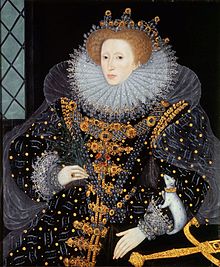
The Ermine Portrait of Elizabeth I of England

The English Renaissance was a cultural and artistic movement in England during the late 15th, 16th and early 17th centuries. It is associated with the pan-European Renaissance that is usually regarded as beginning in Italy in the late 14th century. As in most of the rest of northern Europe, England saw little of these developments until more than a century later within the Northern Renaissance. Renaissance style and ideas were slow to penetrate England, and the Elizabethan era in the second half of the 16th century is usually regarded as the height of the English Renaissance. Many scholars see its beginnings in the early 16th century during the reign of Henry VIII. Others argue the Renaissance was already present in England in the late 15th century.

The English Renaissance is different from the Italian Renaissance in several ways. The dominant art forms of the English Renaissance were literature and music. Visual arts in the English Renaissance were much less significant than in the Italian Renaissance. The English period began far later than the Italian, which was moving into Mannerism and the Baroque by the 1550s or earlier.

Literature

England had a strong tradition of literature in the English vernacular, which gradually increased as English use of the printing press became common by the mid-16th century. This tradition of literature written in English vernacular largely began with the Protestant Reformation's call to let people interpret the Bible for themselves instead of accepting the Catholic Church's interpretation. Discussions on how to translate the Bible so that it could be understood by laymen but still do justice to God's word became contentious, with people arguing how much license could be taken to impart the correct meaning without sacrificing its eloquence. The desire to let people read the Bible for themselves led William Tyndale to publish his own translation in 1526, giving way to Sir Rowland Hill's publication of the Geneva Bible in 1560, marking the re-establishment of the Church of England at the accession of Elizabeth I. These would be predecessors to the King James Version of the Bible.

Another early proponent of literature in the vernacular was Roger Ascham, who was tutor to Princess Elizabeth during her teenage years, and is now often called the "father of English prose." He proposed that speech was the greatest gift to man from God and to speak or write poorly was an affront. The peak of English drama and theatre is said to be the Elizabethan Age; a golden age in English history where the arts, drama and creative work flourished. Morality plays emerged as a distinct dramatic form around 1400 and flourished in the early Elizabethan era in England. By the time of Elizabethan literature, a vigorous literary culture in both drama and poetry included poets such as Edmund Spenser, whose verse epic The Faerie Queene had a strong influence on English literature but was eventually overshadowed by the lyrics of William Shakespeare, Thomas Wyatt and others. Typically, the works of these playwrights and poets circulated in manuscript form for some time before they were published, and above all the plays of English Renaissance theatre were the outstanding legacy of the period. The works of this period are also affected by Henry VIII's declaration of independence from the Catholic Church and technological advances in sailing and cartography, which are reflected in the generally nonreligious themes and various shipwreck adventures of Shakespeare.

William Shakespeare, Christopher Marlowe (disputed portrait), Sir Rowland Hill publisher of multiple books chief of all being the Geneva Bible, and Sir Francis Bacon.

The growing population of London, the growing wealth of its people, and their fondness for spectacle produced a dramatic literature of remarkable variety, quality, and extent. Genres of the period included the history play, which depicted English or European history. Shakespeare's plays about the lives of kings, such as Richard III and Henry V, belong to this category, as do Christopher Marlowe's Edward II and George Peele's Famous Chronicle of King Edward the First. History plays dealt with more recent events, like A Larum for London which dramatizes the sack of Antwerp in 1576. Tragedy was a very popular genre. Marlowe's tragedies were exceptionally successful, such as Dr. Faustus and The Jew of Malta. The audiences particularly liked revenge dramas, such as Thomas Kyd's The Spanish Tragedy. The four tragedies considered to be Shakespeare's greatest (Hamlet, Othello, King Lear, and Macbeth) were composed during this period. The English theatre scene, which performed both for the court and nobility in private performances and a very wide public in the theatres, was the most crowded in Europe, with a host of other playwrights as well as the giant figures of Christopher Marlowe, William Shakespeare and Ben Jonson. Elizabeth herself was a product of Renaissance humanism trained by Roger Ascham, and wrote occasional poems such as "On Monsieur's Departure" at critical moments of her life. William Shakespeare, whose works include Hamlet, Romeo and Juliet, Macbeth, and A Midsummer Night's Dream, remains one of the most championed authors in English literature. The playwright and poet is widely regarded as the greatest dramatist of all time.

Philosophers and intellectuals included Thomas More and Francis Bacon. Francis Bacon and Thomas Hobbes wrote on empiricism and materialism, including scientific method and social contract. Bacon's works are seen as developing the scientific method and remained highly influential through the Scientific Revolution. Robert Filmer wrote on the Divine Right of Kings. All the 16th century Tudor monarchs were highly educated, as was much of the nobility, and Italian literature had a considerable following, providing the sources for many of Shakespeare's plays. English thought advanced towards modern science with the Baconian Method. The language of the Book of Common Prayer, first published in 1549, and at the end of the period the Bible had enduring and profound impacts on the English consciousness.

Visual arts

Large miniature of George Clifford, 3rd Earl of Cumberland by Nicholas Hilliard in 1590 after his appointment as the Queen's Champion.

England was slow to produce visual arts in Renaissance styles, and the artists of the Tudor court were mainly imported foreigners until after the end of the Renaissance; Hans Holbein was the outstanding figure. The English Reformation produced a huge programme of iconoclasm that destroyed almost all medieval religious art, and all but ended the skill of painting in England; English art was to be dominated by portrait painting, and then later landscape art, for centuries to come.

The significant English invention was the portrait miniature, which essentially took the techniques of the dying art of the illuminated manuscript and transferred them to small portraits worn in lockets. Though the form was developed in England by foreign artists, mostly Flemish like Lucas Horenbout, the somewhat undistinguished founder of the tradition, by the late 16th century natives such as Nicolas Hilliard and Isaac Oliver produced the finest work, even as the best producers of larger portraits in oil were still foreigners. The portrait miniature had spread all over Europe by the 18th century.

The portraiture of Elizabeth I was carefully controlled and developed into an elaborate and wholly un-realist iconic style, that has succeeded in creating enduring images. The many portraits drove the evolution of English royal portraits in the Early Modern period. Even the earliest portraits of Elizabeth I contain symbolic objects such as roses and prayer books that would have carried meaning to viewers of her day. Later portraits of Elizabeth layer the iconography of empireglobes, crowns, swords and columns—and representations of virginity and purity—such as moons and pearls—with classical allusions to present a complex "story" that conveyed to Elizabethan era viewers the majesty and significance of their Virgin Queen. The Armada Portrait is an allegorical panel painting depicting the queen surrounded by symbols of empire against a backdrop representing the defeat of the Spanish Armada in 1588.

Music

English Renaissance music kept in touch with continental developments far more than visual art, and managed to survive the Reformation relatively successfully, though William Byrd (c.1539/40 or 1543 – 1623) and other major figures were Catholic. The Elizabethan madrigal was distinct from, but related to, the Italian tradition. Thomas Tallis, (c. 1505 –1585 Thomas Morley (1557 or 1558 – 1602)), and John Dowland (1563 – 1626) were other leading English composers.

The key composers from the early Renaissance era also wrote in a late Medieval style, and as such, they are transitional figures. Leonel Power (c. 1370s or 1380s–1445) was an English composer of the late medieval and early Renaissance music eras. Along with John Dunstaple, he was one of the major figures in English music in the early 15th century. Power is the composer best represented in the Old Hall Manuscript. Power was one of the first composers to set separate movements of the ordinary of the mass which were thematically unified and intended for contiguous performance. The Old Hall Manuscript contains his mass based on the Marian antiphon, Alma Redemptoris Mater, in which the antiphon is stated literally in the tenor voice in each movement, without melodic ornaments. This is the only cyclic setting of the mass ordinary which can be attributed to him. He wrote mass cycles, fragments, and single movements and a variety of other sacred works.

John Dunstaple (or Dunstable) (c. 1390–1453) was an English composer of polyphonic music of the late medieval era and early Renaissance periods. He was one of the most famous composers active in the early 15th century, a near-contemporary of Power, and was widely influential, not only in England but on the continent, especially in the developing style of the Burgundian School. Dunstaple's influence on the continent's musical vocabulary was enormous, particularly considering the relative paucity of his (attributable) works. He was recognized for possessing something never heard before in music of the Burgundian School: la contenance angloise ("the English countenance"), a term used by the poet Martin le Franc in his Le Champion des Dames.

The colossal polychoral productions of the Venetian School had been anticipated in the works of Thomas Tallis, and the Palestrina style from the Roman School had already been absorbed prior to the publication of Musica transalpina, in the music of masters such as William Byrd.

The Italian and English Renaissances were similar in sharing a specific musical aesthetic. In the late 16th century Italy was the musical center of Europe, and one of the principal forms which emerged from that singular explosion of musical creativity was the madrigal. In 1588, Nicholas Yonge published in England the Musica transalpina—a collection of Italian madrigals that had been Anglicized—an event which began a vogue of madrigal in England which was almost unmatched in the Renaissance in being an instantaneous adoption of an idea, from another country, adapted to local aesthetics. English poetry was exactly at the right stage of development for this transplantation to occur, since forms such as the sonnet were uniquely adapted to setting as madrigals; indeed, the sonnet was already well developed in Italy. Composers such as Thomas Morley, the only contemporary composer to set Shakespeare, and whose work survives, published collections of their own, roughly in the Italian manner but yet with a unique Englishness; interest in the compositions of the English Madrigal School has enjoyed a considerable revival in recent decades.

Architecture

Despite some buildings in a partly Renaissance style from the reign of Henry VIII (1491 – 1547), notably Hampton Court Palace (begun in 1515), the vanished Nonsuch Palace, Sutton Place and Layer Marney Tower, and the building of Soulton Hall under Queen Mary I, it was not until dawning of Elizabethan architecture that a true Renaissance style became widespread.

The wool trade, which had carried the economic life of England in the late medieval period, was no longer as prosperous as it had been and there was less disposable wealth for architectural projects. Under Elizabeth, farming was encouraged resulting in a recovery that put a vast amount of wealth into the hands of a large number of people. Elizabeth built no new palaces, instead encouraging her courtiers to build extravagantly and house her on her summer progresses. A large number of small houses were built, and at the same time many country mansions were constructed. Many of the earlier medieval or Tudor manors were remodelled and modernised during Elizabeth's reign. Civic and institutional buildings were also becoming increasingly common.

The most famous buildings, of a type called the prodigy house, are large show houses constructed for courtiers, and characterised by lavish use of glass, as at "Hardwick Hall, more glass than wall", Wollaton Hall, Montacute House, Hatfield House and Burghley House, the style continuing into the early 17th century before developing into Jacobean architecture. Lesser, but still large, houses like Little Moreton Hall continued to be constructed and expanded in essentially medieval half-timbered styles until the late 16th century. Church architecture essentially continued in the late medieval Perpendicular Gothic style until the Reformation, and then stopped almost completely, although church monuments, screens and other fittings often had classical styles from about the mid-century. The few new church buildings post-Reformation were usually still Gothic in style, as in Langley Chapel of 1601.

It was also at this time that the long gallery became popular in English manor houses, often displaying painting collections and decorated ceilings. This was apparently mainly used for walking in, and a growing range of parlours and withdrawing rooms supplemented the main living room for the family, the great chamber. The great hall was now mostly used by the servants, and as an impressive point of entry to the house.

Major English Renaissance authors

Major literary figures in the English Renaissance include:

Typesetting

From Wikipedia, the free encyclopedia
https://en.wikipedia.org/wiki/Typesetting
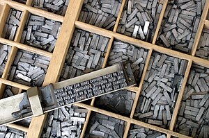
Movable type on a composing stick on a type case
A specimen sheet issued by William Caslon, letter founder, from the 1728 edition of Cyclopaedia
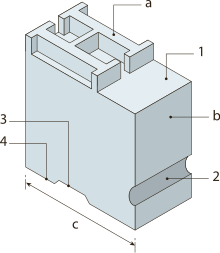
Diagram of a cast metal sort

Typesetting is the composition of text by means of arranging physical type (or sort) in mechanical systems or glyphs in digital systems representing characters (letters and other symbols). Stored types are retrieved and ordered according to a language's orthography for visual display. Typesetting requires one or more fonts (which are widely but erroneously confused with and substituted for typefaces). One significant effect of typesetting was that authorship of works could be spotted more easily, making it difficult for copiers who have not gained permission.

Pre-digital era

Manual typesetting

During much of the letterpress era, movable type was composed by hand for each page by workers called compositors. A tray with many dividers, called a case, contained cast metal sorts, each with a single letter or symbol, but backwards (so they would print correctly). The compositor assembled these sorts into words, then lines, then pages of text, which were then bound tightly together by a frame, making up a form or page. If done correctly, all letters were of the same height, and a flat surface of type was created. The form was placed in a press and inked, and then printed (an impression made) on paper. Metal type read backwards, from right to left, and a key skill of the compositor was their ability to read this backwards text.

Before computers were invented, font sizes were changed by physically adjusting the size of the letterpress type, or by using a different size of type. In letterpress printing, individual letters and punctuation marks were cast on small metal blocks, known as "sorts," and then arranged to form the text for a page. The size of the type was determined by the height of the sort, and a printer would need to physically swap out the sorts for a different size to change the font size.

During typesetting, individual sorts are picked from a type case with the right hand, and set into a composing stick held in the left hand from left to right, and as viewed by the setter upside down. As seen in the photo of the composing stick, a lower case 'q' looks like a 'd', a lower case 'b' looks like a 'p', a lower case 'p' looks like a 'b' and a lower case 'd' looks like a 'q'. This is reputed to be the origin of the expression "mind your p's and q's". It might just as easily have been "mind your b's and d's".

A forgotten but important part of the process took place after the printing: the expensive sorts had to be sorted, so they would be ready for reuse. Errors in sorting would produce later misprints.

The diagram at right illustrates a cast metal sort: a face, b body or shank, c point size, 1 shoulder, 2 nick, 3 groove, 4 foot. Wooden printing sorts were used for centuries in combination with metal type. Not shown, and more the concern of the casterman, is the “set”, or width of each sort. Set width, like body size, is measured in points.

In order to extend the working life of type, and to account for the finite sorts in a case of type, copies of forms were cast when anticipating subsequent printings of a text, freeing the costly type for other work. This was particularly prevalent in book and newspaper work where rotary presses required type forms to wrap an impression cylinder rather than set in the bed of a press. In this process, called stereotyping, the entire form is pressed into a fine matrix such as plaster of Paris or papier mâché to create a flong, from which a positive form is cast in type metal.

Advances such as the typewriter and computer would push the state of the art even farther ahead. Still, hand composition and letterpress printing have not fallen completely out of use, and since the introduction of digital typesetting, it has seen a revival as an artisanal pursuit. However, it is a small niche within the larger typesetting market.

Hot metal typesetting

The time and effort required to manually compose the text led to several efforts in the 19th century to produce mechanical typesetting. While some, such as the Paige compositor, met with limited success, by the end of the 19th century, several methods had been devised whereby an operator working a keyboard or other devices could produce the desired text. Most of the successful systems involved the in-house casting of the type to be used, hence are termed "hot metal" typesetting. The Linotype machine, invented in 1884, used a keyboard to assemble the casting matrices, and cast an entire line of type at a time (hence its name). In the Monotype System, a keyboard was used to punch a paper tape, which was then fed to control a casting machine. The Ludlow Typograph involved hand-set matrices, but otherwise used hot metal. By the early 20th century, the various systems were nearly universal in large newspapers and publishing houses.

Phototypesetting

Linotype CRTronic 360 photosetter, a direct entry machine

Phototypesetting or "cold type" systems first appeared in the early 1960s and rapidly displaced continuous casting machines. These devices consisted of glass or film disks or strips (one per font) that spun in front of a light source to selectively expose characters onto light-sensitive paper. Originally they were driven by pre-punched paper tapes. Later they were connected to computer front ends.

One of the earliest electronic photocomposition systems was introduced by Fairchild Semiconductor. The typesetter typed a line of text on a Fairchild keyboard that had no display. To verify correct content of the line it was typed a second time. If the two lines were identical a bell rang and the machine produced a punched paper tape corresponding to the text. With the completion of a block of lines the typesetter fed the corresponding paper tapes into a phototypesetting device that mechanically set type outlines printed on glass sheets into place for exposure onto a negative film. Photosensitive paper was exposed to light through the negative film, resulting in a column of black type on white paper, or a galley. The galley was then cut up and used to create a mechanical drawing or paste up of a whole page. A large film negative of the page is shot and used to make plates for offset printing.

Digital era

The next generation of phototypesetting machines to emerge were those that generated characters on a cathode ray tube display. Typical of the type were the Alphanumeric APS2 (1963), IBM 2680 (1967), I.I.I. VideoComp (1973?), Autologic APS5 (1975), and Linotron 202 (1978). These machines were the mainstay of phototypesetting for much of the 1970s and 1980s. Such machines could be "driven online" by a computer front-end system or took their data from magnetic tape. Type fonts were stored digitally on conventional magnetic disk drives.

Computers excel at automatically typesetting and correcting documents. Character-by-character, computer-aided phototypesetting was, in turn, rapidly rendered obsolete in the 1980s by fully digital systems employing a raster image processor to render an entire page to a single high-resolution digital image, now known as imagesetting.

The first commercially successful laser imagesetter, able to make use of a raster image processor, was the Monotype Lasercomp. ECRM, Compugraphic (later purchased by Agfa) and others rapidly followed suit with machines of their own.

Early minicomputer-based typesetting software introduced in the 1970s and early 1980s, such as Datalogics Pager, Penta, Atex, Miles 33, Xyvision, troff from Bell Labs, and IBM's Script product with CRT terminals, were better able to drive these electromechanical devices, and used text markup languages to describe type and other page formatting information. The descendants of these text markup languages include SGML, XML and HTML.

The minicomputer systems output columns of text on film for paste-up and eventually produced entire pages and signatures of 4, 8, 16 or more pages using imposition software on devices such as the Israeli-made Scitex Dolev. The data stream used by these systems to drive page layout on printers and imagesetters, often proprietary or specific to a manufacturer or device, drove development of generalized printer control languages, such as Adobe Systems' PostScript and Hewlett-Packard's PCL.

Text sample (an extract of the essay The Renaissance of English Art by Oscar Wilde) typeset in Iowan Old Style roman, italics and small caps, adjusted to approximately 10 words per line, with the typeface sized at 14 points on 1.4 x leading, with 0.2 points extra tracking

Computerized typesetting was so rare that BYTE magazine (comparing itself to "the proverbial shoemaker's children who went barefoot") did not use any computers in production until its August 1979 issue used a Compugraphics system for typesetting and page layout. The magazine did not yet accept articles on floppy disks, but hoped to do so "as matters progress". Before the 1980s, practically all typesetting for publishers and advertisers was performed by specialist typesetting companies. These companies performed keyboarding, editing and production of paper or film output, and formed a large component of the graphic arts industry. In the United States, these companies were located in rural Pennsylvania, New England or the Midwest, where labor was cheap and paper was produced nearby, but still within a few hours' travel time of the major publishing centers.

In 1985, with the new concept of WYSIWYG (for What You See Is What You Get) in text editing and word processing on personal computers, desktop publishing became available, starting with the Apple Macintosh, Aldus PageMaker (and later QuarkXPress) and PostScript and on the PC platform with Xerox Ventura Publisher under DOS as well as Pagemaker under Windows. Improvements in software and hardware, and rapidly lowering costs, popularized desktop publishing and enabled very fine control of typeset results much less expensively than the minicomputer dedicated systems. At the same time, word processing systems, such as Wang, WordPerfect and Microsoft Word, revolutionized office documents. They did not, however, have the typographic ability or flexibility required for complicated book layout, graphics, mathematics, or advanced hyphenation and justification rules (H and J).

By 2000, this industry segment had shrunk because publishers were now capable of integrating typesetting and graphic design on their own in-house computers. Many found the cost of maintaining high standards of typographic design and technical skill made it more economical to outsource to freelancers and graphic design specialists.

The availability of cheap or free fonts made the conversion to do-it-yourself easier, but also opened up a gap between skilled designers and amateurs. The advent of PostScript, supplemented by the PDF file format, provided a universal method of proofing designs and layouts, readable on major computers and operating systems.

QuarkXPress had enjoyed a market share of 95% in the 1990s, but lost its dominance to Adobe InDesign from the mid-2000s onward.

SCRIPT variants

Mural mosaic "Typesetter" at John A. Prior Health Sciences Library in Ohio

IBM created and inspired a family of typesetting languages with names that were derivatives of the word "SCRIPT". Later versions of SCRIPT included advanced features, such as automatic generation of a table of contents and index, multicolumn page layout, footnotes, boxes, automatic hyphenation and spelling verification.

NSCRIPT was a port of SCRIPT to OS and TSO from CP-67/CMS SCRIPT.

Waterloo Script was created at the University of Waterloo (UW) later. One version of SCRIPT was created at MIT and the AA/CS at UW took over project development in 1974. The program was first used at UW in 1975. In the 1970s, SCRIPT was the only practical way to word process and format documents using a computer. By the late 1980s, the SCRIPT system had been extended to incorporate various upgrades.

The initial implementation of SCRIPT at UW was documented in the May 1975 issue of the Computing Centre Newsletter, which noted some the advantages of using SCRIPT:

  1. It easily handles footnotes.
  2. Page numbers can be in Arabic or Roman numerals, and can appear at the top or bottom of the page, in the centre, on the left or on the right, or on the left for even-numbered pages and on the right for odd-numbered pages.
  3. Underscoring or overstriking can be made a function of SCRIPT, thus uncomplicating editor functions.
  4. SCRIPT files are regular OS datasets or CMS files.
  5. Output can be obtained on the printer, or at the terminal…

The article also pointed out SCRIPT had over 100 commands to assist in formatting documents, though 8 to 10 of these commands were sufficient to complete most formatting jobs. Thus, SCRIPT had many of the capabilities computer users generally associate with contemporary word processors.

SCRIPT/VS was a SCRIPT variant developed at IBM in the 1980s.

DWScript is a version of SCRIPT for MS-DOS, named after its author, D. D. Williams, but was never released to the public and only used internally by IBM.

Script is still available from IBM as part of the Document Composition Facility for the z/OS operating system.

SGML and XML systems

The standard generalized markup language (SGML) was based upon IBM Generalized Markup Language (GML). GML was a set of macros on top of IBM Script. DSSSL is an international standard developed to provide a stylesheets for SGML documents.

XML is a successor of SGML. XSL-FO is most often used to generate PDF files from XML files.

The arrival of SGML/XML as the document model made other typesetting engines popular. Such engines include Datalogics Pager, Penta, Miles 33's OASYS, Xyvision's XML Professional Publisher, FrameMaker, and Arbortext. XSL-FO compatible engines include Apache FOP, Antenna House Formatter, and RenderX's XEP. These products allow users to program their SGML/XML typesetting process with the help of scripting languages.

YesLogic's Prince is another one, which is based on CSS Paged Media.

Troff and successors

During the mid-1970s, Joe Ossanna, working at Bell Laboratories, wrote the troff typesetting program to drive a Wang C/A/T phototypesetter owned by the Labs; it was later enhanced by Brian Kernighan to support output to different equipment, such as laser printers. While its use has fallen off, it is still included with a number of Unix and Unix-like systems, and has been used to typeset a number of high-profile technical and computer books. Some versions, as well as a GNU work-alike called groff, are now open source.

TeX and LaTeX

Mathematical text typeset using TeX and the AMS Euler font

The TeX system, developed by Donald E. Knuth at the end of the 1970s, is another widespread and powerful automated typesetting system that has set high standards, especially for typesetting mathematics. LuaTeX and LuaLaTeX are variants of TeX and of LaTeX scriptable in Lua. TeX is considered fairly difficult to learn on its own, and deals more with appearance than structure. The LaTeX macro package, written by Leslie Lamport at the beginning of the 1980s, offered a simpler interface and an easier way to systematically encode the structure of a document. LaTeX markup is widely used in academic circles for published papers and books. Although standard TeX does not provide an interface of any sort, there are programs that do. These programs include Scientific Workplace and LyX, which are graphical/interactive editors; TeXmacs, while being an independent typesetting system, can also aid the preparation of TeX documents through its export capability.

Other text formatters

GNU TeXmacs (whose name is a combination of TeX and Emacs, although it is independent from both of these programs) is a typesetting system which is at the same time a WYSIWYG word processor.

SILE borrows some algorithms from TeX and relies on other libraries such as HarfBuzz and ICU, with an extensible core engine developed in Lua. By default, SILE's input documents can be composed in a custom LaTeX-inspired markup (SIL) or in XML. Via the adjunction of 3rd-party modules, composition in Markdown or Djot is also possible.

A new typesetting system Typst tries to combine a simple markup of the input and the possibility of using common programming constructs with a high typographical quality of the output. This system has been in beta testing since March 2023 and was presented in July 2023 at the Tex Users Group (TUG) 2023 conference.

Several other text-formatting software packages exist—notably Lout, Patoline, Pollen, and Ant —but are not widely used.

Movable type

From Wikipedia, the free encyclopedia
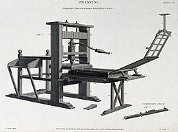
Printing press, engraving by W Lowry after John Farey Jr., 1819

Movable type (US English; moveable type in British English) is the system and technology of printing and typography that uses movable components to reproduce the elements of a document (usually individual alphanumeric characters or punctuation marks) usually on the medium of paper.

Overview

The world's first movable type printing technology for paper books was made of porcelain materials and was invented around AD 1040 in China during the Northern Song dynasty by the inventor Bi Sheng (990–1051). The ealiest printed paper money with movable metal type to print the identifying code of the money was made in 1161 during the Song dynasty. In 1193, a book in the Song dynasty documented how to use the copper movable type. The oldest extant book printed with movable metal type, Jikji, was printed in Korea in 1377 during the Goryeo

The spread of both movable-type systems was, to some degree, limited to primarily East Asia. The development of the printing press in Europe may have been influenced by various sporadic reports of movable type technology brought back to Europe by returning business people and missionaries to China. Some of these medieval European accounts are still preserved in the library archives of the Vatican and Oxford University among many others.

Around 1450, German goldsmith Johannes Gutenberg introduced the metal movable-type printing press in Europe, along with innovations in casting the type based on a matrix and hand mould. The small number of alphabetic characters needed for European languages was an important factor. Gutenberg was the first to create his type pieces from an alloy of lead, tin, and antimony—and these materials remained standard for 550 years.

For alphabetic scripts, movable-type page setting was quicker than woodblock printing. The metal type pieces were more durable and the lettering was more uniform, leading to typography and fonts. The high quality and relatively low price of the Gutenberg Bible (1455) established the superiority of movable type in Europe and the use of printing presses spread rapidly. The printing press may be regarded as one of the key factors fostering the Renaissance and, due to its effectiveness, its use spread around the globe.

The 19th-century invention of hot metal typesetting and its successors caused movable type to decline in the 20th century.

Precursors to movable type

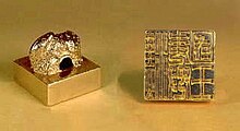
The King of Na gold seal, bestowed by Emperor Guangwu of Han to Wana (Yayoi Japan) in 57 AD.
The intricate frontispiece of the Diamond Sutra from Tang dynasty China, the oldest extant woodblock-printed book, AD 868 (British Museum)

Letter punch and coins

The technique of imprinting multiple copies of symbols or glyphs with a master type punch made of hard metal first developed around 3000 BC in ancient Sumer. These metal punch types can be seen as precursors of the letter punches adapted in later millennia to printing with movable metal type. Cylinder seals were used in Mesopotamia to create an impression on a surface by rolling the seal on wet clay.

Seals and stamps

Seals and stamps may have been precursors to movable type. The uneven spacing of the impressions on brick stamps found in the Mesopotamian cities of Uruk and Larsa, dating from the 2nd millennium BC, has been conjectured by some archaeologists as evidence that the stamps were made using movable type. The enigmatic Minoan Phaistos Disc of c. 1800–1600 BC has been considered by one scholar as an early example of a body of text being reproduced with reusable characters: it may have been produced by pressing pre-formed hieroglyphic "seals" into the soft clay. A few authors even view the disc as technically meeting all definitional criteria to represent an early incidence of movable-type printing.

Woodblock printing

Following the invention of paper during the Chinese Han dynasty, writing materials became more portable and economical than the bones, shells, bamboo slips, metal or stone tablets, silk, etc. previously used. Yet copying books by hand was still labour-consuming. Not until the Xiping Era (172–178 AD), towards the end of the Eastern Han dynasty, did sealing print and monotype appear. It was soon used for printing designs on fabrics, and later for printing texts.

Woodblock printing, invented by about the 8th century during the Tang dynasty, worked as follows. First, the neat hand-copied script was stuck on a relatively thick and smooth board, with the front of the paper, which was so thin that it was nearly transparent, sticking to the board, and characters showing in reverse, but distinctly, so that every stroke could be easily recognized. Then carvers cut away the parts of the board that were not part of the character, so that the characters were cut in relief, completely differently from those cut intaglio. When printing, the bulging characters would have some ink spread on them and be covered by paper. With workers' hands moving on the back of paper gently, characters would be printed on the paper. By the Song dynasty, woodblock printing came to its heyday. Although woodblock printing played an influential role in spreading culture, there were some significant drawbacks. Firstly, carving the printing plate required considerable time, labour and materials; secondly, it was not convenient to store these plates; and finally, it was difficult to correct mistakes.

History

Ceramic movable type

Chinese characters are arranged in the shape of buddha on a page remain of Amitayurdhyana Sutra printed in 1103 (Northern Song dynasty) by ceramic movable type. Found in Baixiang Pagoda, Wenzhou.

Bi Sheng (畢昇) (990–1051) developed the first known movable-type system for printing in China around 1040 AD during the Northern Song dynasty, using ceramic materials. As described by the Chinese scholar Shen Kuo (沈括) (1031–1095):

When he wished to print, he took an iron frame and set it on the iron plate. In this he placed the types, set close together. When the frame was full, the whole made one solid block of type. He then placed it near the fire to warm it. When the paste [at the back] was slightly melted, he took a smooth board and pressed it over the surface, so that the block of type became as even as a whetstone.

For each character there were several types, and for certain common characters there were twenty or more types each, in order to be prepared for the repetition of characters on the same page. When the characters were not in use he had them arranged with paper labels, one label for each rhyme-group, and kept them in wooden cases.

If one were to print only two or three copies, this method would be neither simple nor easy. But for printing hundreds or thousands of copies, it was marvelously quick. As a rule he kept two forms going. While the impression was being made from the one form, the type was being put in place on the other. When the printing of the one form was finished, the other was then ready. In this way the two forms alternated and the printing was done with great rapidity.

In 1193, Zhou Bida, an officer of the Southern Song dynasty, made a set of clay movable-type method according to the method described by Shen Kuo in his Dream Pool Essays, and printed his book Notes of The Jade Hall (《玉堂雜記》). The ceramic movable type was also mentioned by Kublai Khan's counsellor Yao Shu, who convinced his pupil Yang Gu to print language primers using this method. The claim that Bi Sheng's clay types were "fragile" and "not practical for large-scale printing" and "short lived" was refuted by later experiments. Bao Shicheng (1775–1885) wrote that baked clay moveable type was "as hard and tough as horn"; experiments show that clay type, after being baked in an oven, becomes hard and difficult to break, such that it remains intact after being dropped from a height of two metres onto a marble floor. The length of clay movable types in China was 1 to 2 centimetres, not 2mm, thus hard as horn. But similar to metal type, ceramic type did not hold the water-based Chinese calligraphic ink well, and had an added disadvantage of uneven matching of the type which could sometimes result from the uneven changes in size of the type during the baking process.

There has been an ongoing debate regarding the success of ceramic printing technology as there have been no printed materials found with ceramic movable types. However, it is historically recorded to have been used as late as 1844 in China from the Song dynasty through the Qing dynasty.

Movable type was invented during the Northern Song dynasty around the year 1041 by the commoner Bi Sheng. Bi Sheng's movable type was fired in porcelain. After his death, the ceramic movable-type passed onto his descendants. The next mention of movable type occurred in 1193 when a Southern Song chief counsellor, Zhou Bida (周必大), attributed the movable-type method of printing to Shen Kuo. However Shen Kuo did not invent the movable type but credited it to Bi Sheng in his Dream Pool Essays.

Wooden movable type

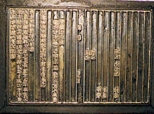
A revolving typecase for wooden type in China, from Wang Zhen's book published in 1313

Bi Sheng (990–1051) of the Song dynasty also pioneered the use of wooden movable type around 1040 AD, as described by the Chinese scholar Shen Kuo (1031–1095). However, this technology was abandoned in favour of clay movable types due to the presence of wood grains and the unevenness of the wooden type after being soaked in ink.

In 1298, Wang Zhen (王禎), a Yuan dynasty governmental official of Jingde County, Anhui Province, China, re-invented a method of making movable wooden types. He made more than 30,000 wooden movable types and printed 100 copies of Records of Jingde County (《旌德縣志》), a book of more than 60,000 Chinese characters. Soon afterwards, he summarized his invention in his book A method of making moveable wooden types for printing books. Although the wooden type was more durable under the mechanical rigors of handling, repeated printing wore down the character faces, and the types could only be replaced by carving new pieces. This system was later enhanced by pressing wooden blocks into sand and casting metal types from the depression in copper, bronze, iron or tin. This new method overcame many of the shortcomings of woodblock printing. Rather than manually carving an individual block to print a single page, movable type printing allowed for the quick assembly of a page of text. Furthermore, these new, more compact type fonts could be reused and stored. Wang Zhen used two rotating circular tables as trays for laying out his type. The first table was separated into 24 trays in which each movable type was categorized based on a number corresponding with a rhyming pattern. The second table contained miscellaneous characters.

The set of wafer-like metal stamp types could be assembled to form pages, inked, and page impressions taken from rubbings on cloth or paper. In 1322, a Fenghua county officer Ma Chengde (馬称德) in Zhejiang, made 100,000 wooden movable types and printed the 43-volume Daxue Yanyi (《大學衍義》). Wooden movable types were used continually in China. Even as late as 1733, a 2300-volume Wuying Palace Collected Gems Edition (《武英殿聚珍版叢書》) was printed with 253,500 wooden movable types on order of the Qianlong Emperor, and completed in one year.

A number of books printed in Tangut script during the Western Xia (1038–1227) period are known, of which the Auspicious Tantra of All-Reaching Union, which was discovered in the ruins of Baisigou Square Pagoda in 1991 is believed to have been printed sometime during the reign of Emperor Renzong of Western Xia (1139–1193). It is considered by many Chinese experts to be the earliest extant example of a book printed using wooden movable type.

Metal movable type

China

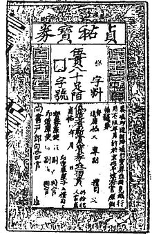
Copperplate printed 5000-cash paper money in year 1215 (Jin dynasty) with bronze movable type counterfeit markers

At least 13 material finds in China indicate the invention of bronze movable type printing in China no later than the 12th century, with the country producing large-scale bronze-plate-printed paper money and formal official documents issued by the Jin (1115–1234) and Southern Song (1127–1279) dynasties with embedded bronze metal types for anti-counterfeit markers. Such paper-money printing might date back to the 11th-century jiaozi of Northern Song (960–1127).

The typical example of this kind of bronze movable type embedded copper-block printing is a printed "check" of the Jin dynasty with two square holes for embedding two bronze movable-type characters, each selected from 1,000 different characters, such that each printed paper note has a different combination of markers. A copper-block printed note dated between 1215 and 1216 in the collection of Luo Zhenyu's Pictorial Paper Money of the Four Dynasties, 1914, shows two special characters – one called Ziliao, the other called Zihao – for the purpose of preventing counterfeiting; over the Ziliao there is a small character (輶) printed with movable copper type, while over the Zihao there is an empty square hole – apparently the associated copper metal type was lost. Another sample of Song dynasty money of the same period in the collection of the Shanghai Museum has two empty square holes above Ziliao as well as Zihou, due to the loss of the two copper movable types. Song dynasty bronze block embedded with bronze metal movable type printed paper money was issued on a large scale and remained in circulation for a long time.[27]

The 1298 book Zao Huozi Yinshufa (《造活字印書法》) by the Yuan dynasty (1271–1368) official Wang Zhen mentions tin movable type, used probably since the Southern Song dynasty (1127–1279), but this was largely experimental. It was unsatisfactory due to its incompatibility with the inking process. But by the late 15th century these concerns were resolved and bronze type was widely used in Chinese printing.

During the Mongol Empire (1206–1405), printing using movable type spread from China to Central Asia. The Uyghurs of Central Asia used movable type, their script type adopted from the Mongol language, some with Chinese words printed between the pages – strong evidence that the books were printed in China.

During the Ming dynasty (1368–1644), Hua Sui in 1490 used bronze type in printing books. In 1574 the massive 1000-volume encyclopedia Imperial Readings of the Taiping Era (《太平御覧》) was printed with bronze movable type.

In 1725 the Qing dynasty government made 250,000 bronze movable-type characters and printed 64 sets of the encyclopedic Complete Classics Collection Of Ancient China (《古今圖書集成》). Each set consisted of 5,040 volumes, making a total of 322,560 volumes printed using movable type.

Korea

Korean movable type from 1377 used for the Jikji
Printed pages of the Jikji

In 1234 the first books known to have been printed in metallic type set were published in Goryeo dynasty Korea. They form a set of ritual books, Sangjeong Gogeum Yemun, compiled by Choe Yun-ui.

While these books have not survived, the oldest book existing in the world printed in metallic movable types is Jikji, printed in Korea in 1377. The Asian Reading Room of the Library of Congress in Washington, D.C. displays examples of this metal type. Commenting on the invention of metallic types by Koreans, French scholar Henri-Jean Martin described this as "[extremely similar] to Gutenberg's". However, Korean movable metal type printing differed from European printing in the materials used for the type, punch, matrix, mould and in method of making an impression.

The techniques for bronze casting, used at the time for making coins (as well as bells and statues) were adapted to making metal type. The Joseon dynasty scholar Seong Hyeon (성현, 成俔, 1439–1504) records the following description of the Korean font-casting process:

At first, one cuts letters in beech wood. One fills a trough level with fine sandy [clay] of the reed-growing seashore. Wood-cut letters are pressed into the sand, then the impressions become negative and form letters [moulds]. At this step, placing one trough together with another, one pours the molten bronze down into an opening. The fluid flows in, filling these negative moulds, one by one becoming type. Lastly, one scrapes and files off the irregularities, and piles them up to be arranged.

A potential solution to the linguistic and cultural bottleneck that held back movable type in Korea for 200 years appeared in the early 15th century—a generation before Gutenberg would begin working on his own movable-type invention in Europe—when Sejong the Great devised a simplified alphabet of 24 characters (hangul) for use by the common people, which could have made the typecasting and compositing process more feasible. But Korea's cultural elite, "appalled at the idea of losing hanja, the badge of their elitism", stifled the adoption of the new alphabet.

A "Confucian prohibition on the commercialization of printing" also obstructed the proliferation of movable type, restricting the distribution of books produced using the new method to the government. The technique was restricted to use by the royal foundry for official state publications only, where the focus was on reprinting Chinese classics lost in 1126 when Korea's libraries and palaces had perished in a conflict between dynasties.

Scholarly debate and speculation has occurred as to whether Eastern movable type spread to Europe between the late 14th century and early 15th centuries. For example, authoritative historians Frances Gies and Joseph Gies claimed that "The Asian priority of invention movable type is now firmly established, and that Chinese-Korean technique, or a report of it traveled westward is almost certain." However, Joseph P. McDermott claimed that "No text indicates the presence or knowledge of any kind of Asian movable type or movable type imprint in Europe before 1450. The material evidence is even more conclusive."

Europe

The Printing Revolution in the 15th century: Within several decades around 270 European towns took up movable-type printing.
European output of movable-type printing from Gutenberg to 1800

Johannes Gutenberg of Mainz, Germany, is acknowledged as the first to invent a metal movable-type printing system in Europe: the printing press, 78 years after Jikji (the oldest preserved book printed with movable metal type) had been printed in Korea. Gutenberg, as a goldsmith, knew techniques of cutting punches for making coins from moulds. Between 1436 and 1450 he developed hardware and techniques for casting letters from matrices using a device called the hand mould. Gutenberg's key invention and contribution to movable-type printing in Europe, the hand mould, was the first practical means of making cheap copies of letterpunches in the vast quantities needed to print complete books, making the movable-type printing process a viable enterprise.

Before Gutenberg, scribes copied books by hand on scrolls and paper, or print-makers printed texts from hand-carved wooden blocks. Either process took a long time; even a small book could take months to complete. Because carved letters or blocks were flimsy and the wood susceptible to ink, the blocks had a limited lifespan.

Gutenberg and his associates developed oil-based inks ideally suited to printing with a press on paper, and the first Latin typefaces. His method of casting type may have differed from the hand-mould used in subsequent decades. Detailed analysis of the type used in his 42-line Bible has revealed irregularities in some of the characters that cannot be attributed to ink spread or type wear under the pressure of the press. Scholars conjecture that the type pieces may have been cast from a series of matrices made with a series of individual stroke punches, producing many different versions of the same glyph.

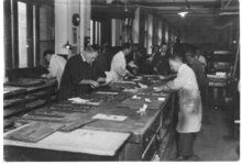
Editing with movable metal – cca. 1920

It has also been suggested that the method used by Gutenberg involved using a single punch to make a mould, but the mould was such that the process of taking the type out disturbed the casting, causing variants and anomalies, and that the punch-matrix system came into use possibly around the 1470s.

This raises the possibility that the development of movable type in the West may have been progressive rather than a single innovation.

Gutenberg's movable-type printing system spread rapidly across Europe, from the single Mainz printing press in 1457 to 110 presses by 1480, with 50 of them in Italy. Venice quickly became the centre of typographic and printing activity. Significant contributions came from Nicolas Jenson, Francesco Griffo, Aldus Manutius, and other printers of late 15th-century Europe. Gutenberg's movable type printing system offered a number of advantages over previous movable type techniques. The lead-antimony-tin alloy used by Gutenberg had half the melting temperature of bronze, making it easier to cast the type and aided the use of reusable metal matrix moulds instead of the expendable sand and clay moulds. The use of antimony alloy increased hardness of the type compared to lead and tin for improved durability of the type. The reusable metal matrix allowed a single experienced worker to produce 4,000 to 5,000 individual types a day, while Wang Chen had artisans working 2 years to make 60,000 wooden types.

Type-founding

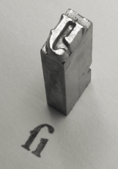
A piece of cast metal type, Garamond style long s i ligature. See also: Sort.

Stages

Type-founding as practised in Europe and the West consists of three stages:

Punchcutting
If the glyph design includes enclosed spaces (counters) then a counterpunch is made. The counter shapes are transferred in relief (cameo) onto the end of a rectangular bar of carbon steel using a specialized engraving tool called a graver. The finished counterpunch is hardened by heating and quenching (tempering), or exposure to a hot cyanide compound (case hardening). The counterpunch is then struck against the end of a similar rectangular steel bar—the letterpunch—to impress the counter shapes as recessed spaces (intaglio). The outer profile of the glyph is completed by scraping away with a graver the material outside the counter spaces, leaving only the stroke or lines of the glyph. Progress toward the finished design is checked by successive smoke proofs; temporary prints made from a thin coating of carbon deposited on the punch surface by a candle flame. The finished letter punch is finally hardened to withstand the rigours of reproduction by striking. One counterpunch and one letterpunch are produced for every letter or glyph making up a complete font.
Matrix
The letterpunch is used to strike a blank die of soft metal to make a negative letter mould, called a matrix.
Casting
The matrix is inserted into the bottom of a device called a hand mould. The mould is clamped shut and molten type metal alloy (consisting mostly of lead and tin, with a small amount of antimony for hardening) is poured into a cavity from the top. Antimony has the rare property of expanding as it cools, giving the casting sharp edges. When the type metal has sufficiently cooled, the mould is unlocked and a rectangular block approximately 4 cm (1.6 in) long, called a sort, is extracted. Excess casting on the end of the sort, called the tang, is later removed to make the sort the precise height required for printing, known as "type height".

National traditions

The type-height varied in different countries. The Monotype Corporation Limited in London UK produced moulds in various heights:

  • 0.918 inches (23.3 mm): United Kingdom, Canada, U.S.
  • 0.928 inches (23.6 mm): France, Germany, Switzerland and most other European countries
  • 0.933 inches (23.7 mm): Belgium height
  • 0.9785 inches (24.85 mm): Dutch height

A Dutch printer's manual mentions a tiny difference between French and German Height:

  • 62.027 points Didot = 23.30 mm (0.917 in) = English height
  • 62.666 points Didot = 23.55 mm (0.927 in) = French height
  • 62.685 points Didot = 23.56 mm (0.928 in) = German height
  • 66.047 points Didot = 24.85 mm (0.978 in) = Dutch Height

Tiny differences in type-height can cause quite bold images of characters.

At the end of the 19th century there were only two typefoundries left in the Netherlands: Johan Enschedé & Zonen, at Haarlem, and Lettergieterij Amsterdam, voorheen Tetterode. They both had their own type-height: Enschedé: 65 23/24 points Didot, and Amsterdam: 66 1/24 points Didot – enough difference to prevent a combined use of fonts from the two typefoundries: Enschede would be too light, or otherwise the Amsterdam-font would print rather bold. This was a way of keeping clients.

In 1905 the Dutch governmental Algemeene Landsdrukkerij, later: "State-printery" (Staatsdrukkerij) decided during a reorganisation to use a standard type-height of 63 points Didot. Staatsdrukkerij-hoogte, actually Belgium-height, but this fact was not widely known.

Typesetting

A case of cast metal type pieces and typeset matter in a composing stick

Modern, factory-produced movable type was available in the late 19th century. It was held in the printing shop in a job case, a drawer about 2 inches high, a yard wide, and about two feet deep, with many small compartments for the various letters and ligatures. The most popular and accepted of the job case designs in America was the California Job Case, which took its name from the Pacific coast location of the foundries that made the case popular.

Traditionally, the capital letters were stored in a separate drawer or case that was located above the case that held the other letters; this is why capital letters are called "upper case" characters while the non-capitals are "lower case".

Compartments also held spacers, which are blocks of blank type used to separate words and fill out a line of type, such as em and en quads (quadrats, or spaces. A quadrat is a block of type whose face is lower than the printing letters so that it does not itself print.). An em space was the width of a capital letter "M" – as wide as it was high – while an en space referred to a space half the width of its height (usually the dimensions for a capital "N").

Individual letters are assembled into words and lines of text with the aid of a composing stick, and the whole assembly is tightly bound together to make up a page image called a forme, where all letter faces are exactly the same height to form a flat surface of type. The forme is mounted on a printing press, a thin coating of viscous ink is applied, and impressions are made on paper under great pressure in the press. "Sorts" is the term given to special characters not freely available in the typical type case, such as the "@" mark.

Metal type combined with other methods

Ceramic type from the collections of University of Reading.

Sometimes, it is erroneously stated that printing with metal type replaced the earlier methods. In the industrial era printing methods would be chosen to suit the purpose. For example, when printing large scale letters in posters etc. the metal type would have proved too heavy and economically unviable. Thus, large scale type was made as carved wood blocks as well as ceramics plates. Also in many cases where large scale text was required, it was simpler to hand the job to a sign painter than a printer. Images could be printed together with movable type if they were made as woodcuts or wood engravings as long as the blocks were made to the same type height. If intaglio methods, such as copper plates, were used for the images, then images and the text would have required separate print runs on different machines.

Politics of Europe

From Wikipedia, the free encyclopedia ...