In the
industrial design field of
human-computer interaction, a
user interface (
UI)
is the space where interactions between humans and machines occur. The
goal of this interaction is to allow effective operation and control of
the machine from the human end, whilst the machine simultaneously feeds
back information that aids the operators'
decision-making process. Examples of this broad concept of user interfaces include the interactive aspects of computer
operating systems, hand
tools,
heavy machinery operator controls, and
process controls. The design considerations applicable when creating user interfaces are related to, or involve such disciplines as,
ergonomics and
psychology.
Generally, the goal of
user interface design
is to produce a user interface which makes it easy, efficient, and
enjoyable (user-friendly) to operate a machine in the way which produces
the desired result (i.e. maximum
usability).
This generally means that the operator needs to provide minimal input
to achieve the desired output, and also that the machine minimizes
undesired outputs to the user.
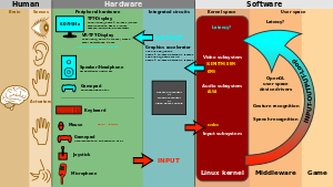
User interfaces are composed of one or more layers, including a
human-machine interface (
HMI) that interfaces machines with physical
input hardware such as keyboards, mice, or game pads, and output hardware such as
computer monitors, speakers, and
printers. A device that implements an HMI is called a
human interface device (HID). Other terms for human-machine interfaces are
man-machine interface (
MMI) and, when the machine in question is a computer,
human-computer interface. Additional UI layers may interact with one or more human senses, including: tactile UI (
touch), visual UI (
sight), auditory UI (
sound), olfactory UI (
smell), equilibrial UI (
balance), and gustatory UI (
taste).
Composite user interfaces (
CUIs) are UIs that interact with two or more senses. The most common CUI is a
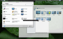
graphical user interface (GUI), which is composed of a tactile UI and a visual UI capable of displaying
graphics. When sound is added to a GUI, it becomes a multimedia user interface (MUI). There are three broad categories of CUI:
standard,
virtual and
augmented.
Standard composite user interfaces use standard human interface devices
like keyboards, mice, and computer monitors. When the CUI blocks out
the real world to create a
virtual reality, the CUI is virtual and uses a virtual reality interface. When the CUI does not block out the real world and creates
augmented reality,
the CUI is augmented and uses an augmented reality interface. When a UI
interacts with all human senses, it is called a qualia interface, named
after the theory of
qualia.
CUI may also be classified by how many senses they interact with as
either an X-sense virtual reality interface or X-sense augmented reality
interface, where X is the number of senses interfaced with. For
example, a
Smell-O-Vision is a 3-sense (3S) Standard CUI with visual display, sound and smells; when
virtual reality interfaces interface with smells and touch it is said to be a 4-sense (4S) virtual reality interface; and when
augmented reality interfaces interface with smells and touch it is said to be a 4-sense (4S) augmented reality interface.
Overview
The user interface or human–machine interface is the part of
the machine that handles the human–machine interaction. Membrane
switches, rubber keypads and touchscreens are examples of the physical
part of the Human Machine Interface which we can see and touch.
In complex systems, the human–machine interface is typically computerized. The term
human–computer interface
refers to this kind of system. In the context of computing, the term
typically extends as well to the software dedicated to control the
physical elements used for
human-computer interaction.
Terminology
There is a difference between a user interface and an operator interface or a human–machine interface (HMI).
- The term "user interface" is often used in the context of (personal) computer systems and electronic devices.
- Where a network of equipment or computers are interlinked
through an MES (Manufacturing Execution System)-or Host to display
information.
- A human-machine interface (HMI) is typically local to one machine or
piece of equipment, and is the interface method between the human and
the equipment/machine. An operator interface is the interface method by
which multiple pieces of equipment that are linked by a host control
system are accessed or controlled.
- The system may expose several user interfaces to serve different kinds of users. For example, a computerized library database
might provide two user interfaces, one for library patrons (limited set
of functions, optimized for ease of use) and the other for library
personnel (wide set of functions, optimized for efficiency).
- The user interface of a mechanical system, a vehicle or an industrial installation is sometimes referred to as the human–machine interface (HMI). HMI is a modification of the original term MMI (man-machine interface). In practice, the abbreviation MMI is still frequently used although some may claim that MMI stands for something different now. Another abbreviation is HCI, but is more commonly used for human–computer interaction. Other terms used are operator interface console (OIC) and operator interface terminal (OIT).
However it is abbreviated, the terms refer to the 'layer' that
separates a human that is operating a machine from the machine itself. Without a clean and usable interface, humans would not be able to interact with information systems.
In some circumstances, computers might observe the user and react
according to their actions without specific commands. A means of
tracking parts of the body is required, and sensors noting the position of the head,
direction of gaze and so on have been used experimentally. This is particularly relevant to
immersive interfaces.
History
The history of user interfaces can be divided into the following phases according to the dominant type of user interface:
1945–1968: Batch interface
In the batch era, computing power was extremely scarce and expensive.
User interfaces were rudimentary. Users had to accommodate computers
rather than the other way around; user interfaces were considered
overhead, and software was designed to keep the processor at maximum
utilization with as little overhead as possible.
The input side of the user interfaces for batch machines was mainly
punched cards or equivalent media like
paper tape. The output side added
line printers to these media. With the limited exception of the system
operator's console, human beings did not interact with batch machines in real time at all.
Submitting a job to a batch machine involved, first, preparing a
deck of punched cards describing a program and a dataset. Punching the
program cards wasn't done on the computer itself, but on
keypunches,
specialized typewriter-like machines that were notoriously bulky,
unforgiving, and prone to mechanical failure. The software interface was
similarly unforgiving, with very strict syntaxes meant to be parsed by
the smallest possible compilers and interpreters.
Holes are punched in the card according to a prearranged code transferring the facts from the census questionnaire into
statistics
Once the cards were punched, one would drop them in a job queue and
wait. Eventually, operators would feed the deck to the computer, perhaps
mounting
magnetic tapes
to supply another dataset or helper software. The job would generate a
printout, containing final results or an abort notice with an attached
error log. Successful runs might also write a result on magnetic tape or
generate some data cards to be used in a later computation.
The
turnaround time
for a single job often spanned entire days. If one were very lucky, it
might be hours; there was no real-time response. But there were worse
fates than the card queue; some computers required an even more tedious
and error-prone process of toggling in programs in binary code using
console switches. The very earliest machines had to be partly rewired to
incorporate program logic into themselves, using devices known as
plugboards.
Early batch systems gave the currently running job the entire
computer; program decks and tapes had to include what we would now think
of as
operating system
code to talk to I/O devices and do whatever other housekeeping was
needed. Midway through the batch period, after 1957, various groups
began to experiment with so-called “
load-and-go” systems. These used a
monitor program
which was always resident on the computer. Programs could call the
monitor for services. Another function of the monitor was to do better
error checking on submitted jobs, catching errors earlier and more
intelligently and generating more useful feedback to the users. Thus,
monitors represented the first step towards both operating systems and
explicitly designed user interfaces.
1969–present: Command-line user interface
Command-line interfaces (CLIs) evolved from batch monitors
connected to the system console. Their interaction model was a series of
request-response transactions, with requests expressed as textual
commands in a specialized vocabulary. Latency was far lower than for
batch systems, dropping from days or hours to seconds. Accordingly,
command-line systems allowed the user to change his or her mind about
later stages of the transaction in response to real-time or
near-real-time feedback on earlier results. Software could be
exploratory and interactive in ways not possible before. But these
interfaces still placed a relatively heavy
mnemonic load on the user, requiring a serious investment of effort and learning time to master.
The earliest command-line systems combined
teleprinters
with computers, adapting a mature technology that had proven effective
for mediating the transfer of information over wires between human
beings. Teleprinters had originally been invented as devices for
automatic telegraph transmission and reception; they had a history going
back to 1902 and had already become well-established in newsrooms and
elsewhere by 1920. In reusing them, economy was certainly a
consideration, but psychology and the
Rule of Least Surprise mattered as well; teleprinters provided a point of interface with the system that was familiar to many engineers and users.
The widespread adoption of video-display terminals (VDTs) in the
mid-1970s ushered in the second phase of command-line systems. These cut
latency further, because characters could be thrown on the phosphor
dots of a screen more quickly than a printer head or carriage can move.
They helped quell conservative resistance to interactive programming by
cutting ink and paper consumables out of the cost picture, and were to
the first TV generation of the late 1950s and 60s even more iconic and
comfortable than teleprinters had been to the computer pioneers of the
1940s.
Just as importantly, the existence of an accessible screen — a
two-dimensional display of text that could be rapidly and reversibly
modified — made it economical for software designers to deploy
interfaces that could be described as visual rather than textual. The
pioneering applications of this kind were computer games and text
editors; close descendants of some of the earliest specimens, such as
rogue(6), and
vi(1), are still a live part of
Unix tradition.
1985: SAA User Interface or Text-Based User Interface
This defined that a pulldown menu system should be at the top of
the screen, status bar at the bottom, shortcut keys should stay the same
for all common functionality (F2 to Open for example would work in all
applications that followed the SAA standard). This greatly helped the
speed at which users could learn an application so it caught on quick
and became an industry standard.
1968–present: Graphical User Interface
AMX Desk made a basic
WIMP GUI
Linotype WYSIWYG 2000, 1989
- 1968 – Douglas Engelbart demonstrated NLS, a system which uses a mouse, pointers, hypertext, and multiple windows.
- 1970 – Researchers at Xerox Palo Alto Research Center (many from SRI) develop WIMP paradigm (Windows, Icons, Menus, Pointers)
- 1973 – Xerox Alto: commercial failure due to expense, poor user interface, and lack of programs
- 1979 – Steve Jobs and other Apple engineers visit Xerox PARC. Though Pirates of Silicon Valley
dramatizes the events, Apple had already been working on developing a
GUI, such as the Macintosh and Lisa projects, before the visit.
- 1981 – Xerox Star: focus on WYSIWYG.
Commercial failure (25K sold) due to cost ($16K each), performance
(minutes to save a file, couple of hours to recover from crash), and
poor marketing
- 1984 – Apple Macintosh popularizes the GUI. Super Bowl commercial shown twice, was the most expensive commercial ever made at that time
- 1984 – MIT's X Window System: hardware-independent platform and networking protocol for developing GUIs on UNIX-like systems
- 1985 – Windows 1.0 – provided GUI interface to MS-DOS. No overlapping windows (tiled instead).
- 1985 – Microsoft and IBM start work on OS/2 meant to eventually replace MS-DOS and Windows
- 1986 – Apple threatens to sue Digital Research because their GUI desktop looked too much like Apple's Mac.
- 1987 – Windows 2.0 – Overlapping and resizable windows, keyboard and mouse enhancements
- 1987 – Macintosh II: first full-color Mac
- 1988 – OS/2 1.10 Standard Edition (SE) has GUI written by Microsoft, looks a lot like Windows 2
Interface design
Primary methods used in the interface design include prototyping and simulation.
Typical human–machine interface design consists of the following
stages: interaction specification, interface software specification and
prototyping:
- Common practices for interaction specification include user-centered design, persona, activity-oriented design, scenario-based design, and resiliency design.
- Common practices for interface software specification include use cases and constrain enforcement by interaction protocols (intended to avoid use errors).
- Common practices for prototyping are based on libraries of interface elements (controls, decoration, etc.).
Principles of quality
All great interfaces share eight qualities or characteristics:
- Clarity: The interface avoids ambiguity by making everything
clear through language, flow, hierarchy and metaphors for visual
elements.
- Concision:
It's easy to make the interface clear by over-clarifying and labeling
everything, but this leads to interface bloat, where there is just too
much stuff on the screen at the same time. If too many things are on the
screen, finding what you're looking for is difficult, and so the
interface becomes tedious to use. The real challenge in making a great
interface is to make it concise and clear at the same time.
- Familiarity:
Even if someone uses an interface for the first time, certain elements
can still be familiar. Real-life metaphors can be used to communicate
meaning.
- Responsiveness:
A good interface should not feel sluggish. This means that the
interface should provide good feedback to the user about what's
happening and whether the user's input is being successfully processed.
- Consistency: Keeping your interface consistent across your application is important because it allows users to recognize usage patterns.
- Aesthetics:
While you don't need to make an interface attractive for it to do its
job, making something look good will make the time your users spend
using your application more enjoyable; and happier users can only be a
good thing.
- Efficiency: Time is money, and a great interface should make the user more productive through shortcuts and good design.
- Forgiveness: A good interface should not punish users for their mistakes but should instead provide the means to remedy them.
Principle of least astonishment
The
principle of least astonishment
(POLA) is a general principle in the design of all kinds of interfaces.
It is based on the idea that human beings can only pay full attention
to one thing at one time, leading to the conclusion that novelty should be minimized.
Principle of habit formation
If an interface is used persistently, the user will unavoidably develop
habits
for using the interface. The designer's role can thus be characterized
as ensuring the user forms good habits. If the designer is experienced
with other interfaces, they will similarly develop habits, and often
make unconscious assumptions regarding how the user will interact with
the interface.
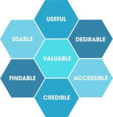
A model of design criteria: User Experience Honeycomb
Peter Morville of
Google
designed the User Experience Honeycomb framework in 2004 when leading
operations in user interface design. The framework was created to guide
user interface design. It would act as a guideline for many web
development students for a decade.
- Usable: Is the design of the system easy and simple to use? The application should feel familiar, and it should be easy to use.
- Useful: Does the application fulfill a need? A business’s product or service needs to be useful.
- Desirable: Is the design of the application sleek and to the point?
The aesthetics of the system should be attractive, and easy to
translate.
- Findable: Are users able to quickly find the information they're
looking for? Information needs to be findable and simple to navigate. A
user should never have to hunt for your product or information.
- Accessible:
Does the application support enlarged text without breaking the
framework? An application should be accessible to those with
disabilities.
- Credible: Does the application exhibit trustworthy security and
company details? An application should be transparent, secure, and
honest.
- Valuable: Does the end-user think it's valuable? If all 6 criteria
are met, the end-user will find value and trust in the application.
Types
HP Series 100 HP-150 Touchscreen
- Attentive user interfaces manage the user attention deciding when to interrupt the user, the kind of warnings, and the level of detail of the messages presented to the user.
- Batch interfaces are non-interactive user interfaces, where the user specifies all the details of the batch job in advance to batch processing,
and receives the output when all the processing is done. The computer
does not prompt for further input after the processing has started.
- Command line interfaces (CLIs) prompt the user to provide input by typing a command string
with the computer keyboard and respond by outputting text to the
computer monitor. Used by programmers and system administrators, in
engineering and scientific environments, and by technically advanced
personal computer users.
- Conversational interfaces
enable users to command the computer with plain text English (e.g., via
text messages, or chatbots) or voice commands, instead of graphic
elements. These interfaces often emulate human-to-human conversations.
- Conversational interface agents attempt to personify the
computer interface in the form of an animated person, robot, or other
character (such as Microsoft's Clippy the paperclip), and present
interactions in a conversational form.
- Crossing-based interfaces are graphical user interfaces in which the primary task consists in crossing boundaries instead of pointing.
- Direct manipulation interface
is the name of a general class of user interfaces that allow users to
manipulate objects presented to them, using actions that correspond at
least loosely to the physical world.
- Gesture interfaces are graphical user interfaces which accept input in a form of hand gestures, or mouse gestures sketched with a computer mouse or a stylus.
- Graphical user interfaces (GUI) accept input via devices such as a computer keyboard and mouse and provide articulated graphical output on the computer monitor. There are at least two different principles widely used in GUI design: Object-oriented user interfaces (OOUIs) and application-oriented interfaces.
- Hardware interfaces are the physical, spatial interfaces
found on products in the real world from toasters, to car dashboards, to
airplane cockpits. They are generally a mixture of knobs, buttons,
sliders, switches, and touchscreens.
- Holographic user interfaces
provide input to electronic or electro-mechanical devices by passing a
finger through reproduced holographic images of what would otherwise be
tactile controls of those devices, floating freely in the air, detected
by a wave source and without tactile interaction.
- Intelligent user interfaces
are human-machine interfaces that aim to improve the efficiency,
effectiveness, and naturalness of human-machine interaction by
representing, reasoning, and acting on models of the user, domain, task,
discourse, and media (e.g., graphics, natural language, gesture).
- Motion tracking interfaces monitor the user's body motions and translate them into commands, currently being developed by Apple.
- Multi-screen interfaces, employ multiple displays to provide a
more flexible interaction. This is often employed in computer game
interaction in both the commercial arcades and more recently the
handheld markets.
- Natural-language interfaces are used for search engines and on webpages. User types in a question and waits for a response.
- Non-command user interfaces, which observe the user to infer their needs and intentions, without requiring that they formulate explicit commands.
- Object-oriented user interfaces (OOUI) are based on object-oriented programming metaphors, allowing users to manipulate simulated objects and their properties.
- Permission-driven user interfaces show or conceal menu
options or functions depending on the user's level of permissions. The
system is intended to improve the user experience by removing items that
are unavailable to the user. A user who sees functions that are
unavailable for use may become frustrated. It also provides an
enhancement to security by hiding functional items from unauthorized
persons.
- Reflexive user interfaces where the users control and redefine the entire system via the user interface alone, for instance to change its command verbs. Typically, this is only possible with very rich graphic user interfaces.
- Search interface is how the search box of a site is displayed, as well as the visual representation of the search results.
- Tangible user interfaces, which place a greater emphasis on touch and physical environment or its element.
- Task-focused interfaces are user interfaces which address the information overload problem of the desktop metaphor by making tasks, not files, the primary unit of interaction.
- Text-based user interfaces (TUIs) are user interfaces which interact via text. TUIs include command-line interfaces and text-based WIMP environments.
- Touchscreens are displays that accept input by touch of fingers or a stylus. Used in a growing amount of mobile devices and many types of point of sale, industrial processes and machines, self-service machines, etc.
- Touch user interface are graphical user interfaces using a touchpad or touchscreen display as a combined input and output device. They supplement or replace other forms of output with haptic feedback methods. Used in computerized simulators, etc.
- Voice user interfaces,
which accept input and provide output by generating voice prompts. The
user input is made by pressing keys or buttons, or responding verbally
to the interface.
- Web-based user interfaces or web user interfaces (WUI) that accept input and provide output by generating web pages viewed by the user using a web browser program. Newer implementations utilize PHP, Java, JavaScript, AJAX, Apache Flex, .NET Framework,
or similar technologies to provide real-time control in a separate
program, eliminating the need to refresh a traditional HTML-based web
browser. Administrative web interfaces for web-servers, servers and
networked computers are often called control panels.
- Zero-input interfaces get inputs from a set of sensors instead of querying the user with input dialogs.
- Zooming user interfaces
are graphical user interfaces in which information objects are
represented at different levels of scale and detail, and where the user
can change the scale of the viewed area in order to show more detail.


